
Printing Color: Chiaroscuro to Screenprint, Legion of Honor
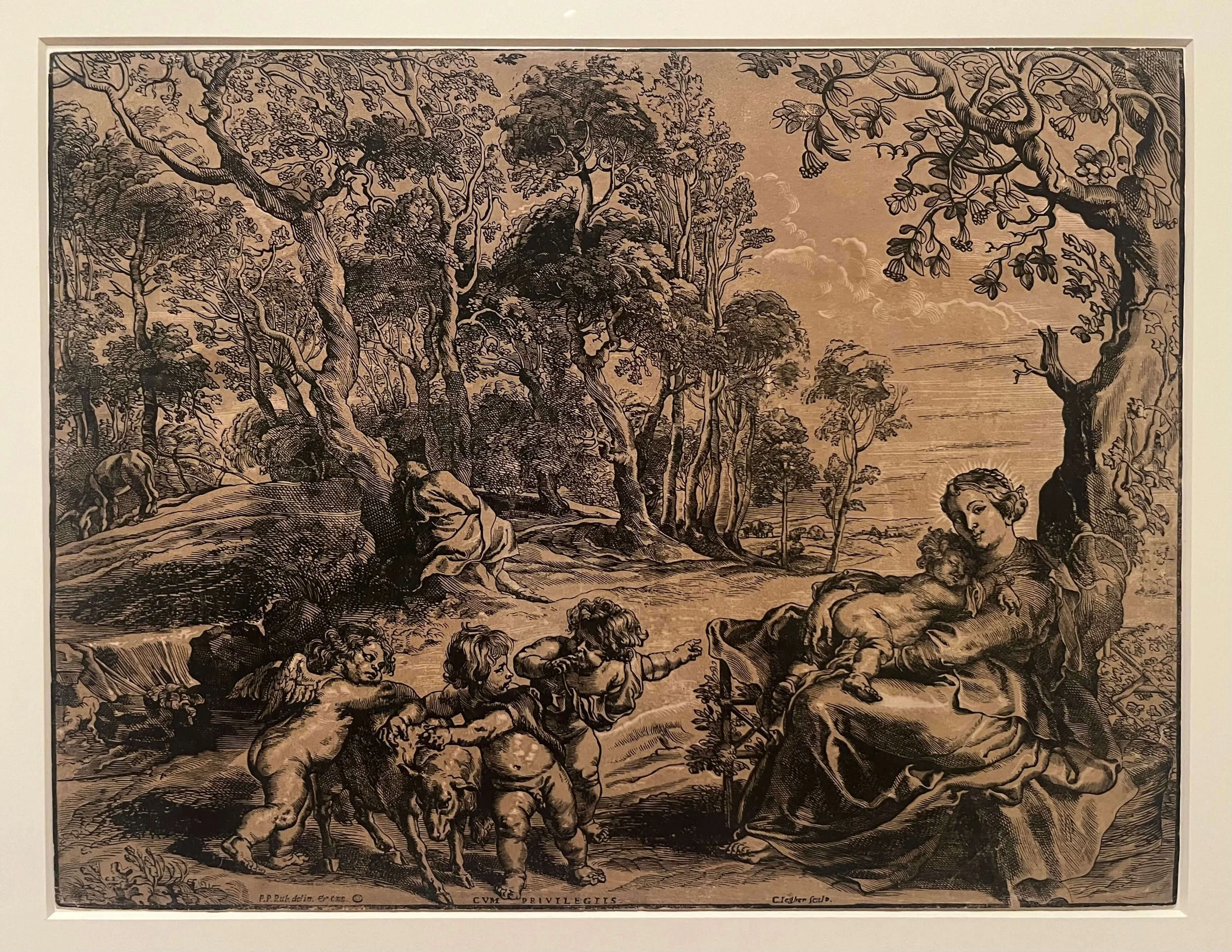
Christoffel Jegher after Peter Paul Rubens, The Rest on the Flight into Egypt, Chiaroscuro woodcut, 45.5 x 59.9 cm
May 24, 2025 – January 4, 2026
By Carlos Alcalá
The Legion of Honor’s Printing Color tells a story, “a narrative,” to use a favorite term of Natalia Lauricella. Lauricella is curator of prints and drawings at the Achenbach Foundation, which mounted the show in Gallery 22 of the museum. Printing Color is the narrative, but Gallery 22 is its backstory.
Contemporary shows offer narratives we haven’t heard previously, or ones that had only been whispered before. The recent Thiebaud exhibition at the Legion, Art Comes from Art, showed how artistic theft rises beyond paint rags to achieve richness. The Legion’s current Manet & Morisot – by showing us two painters, their mutual education, and their relationship – goes beyond biography to provide a lens through which familiar paintings look new. A narrative lens.
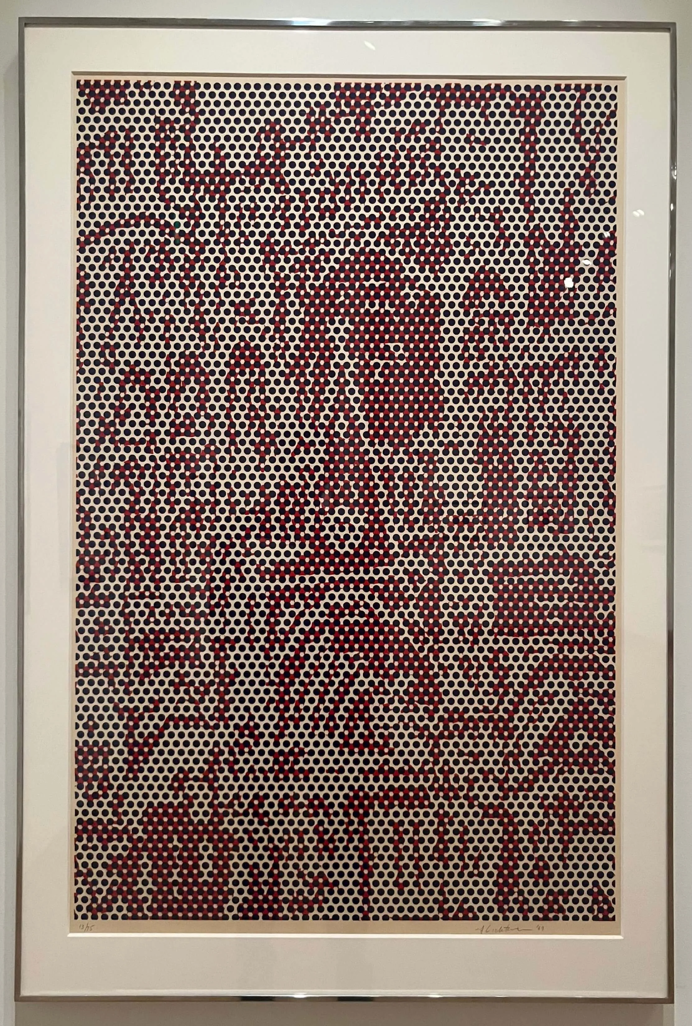
Roy Lichtenstein, Catherdral #4, Color lithograph, 1062 x 686 mm
The primary narrative for Printing Color is in the show’s subtitle, Chiaroscuro to Screenprint. Over the ages, color came to provide new dimension – quite literally – to printed works. We travel a journey up to contemporary screenprinting, starting at chiaroscuro – a 15th-century innovation that added tones to ink-black and paper-white in order to suggest three dimensions.
With nearly three dozen artists and hundreds of years shown in Printing Color, the linear narrative is not the only story. Visitors always find others.
At the Thiebaud show in April, a woman on her fourth visit revealed to me that she assigned herself a different lens for enjoying the show each time. That time around, she focused on signatures. She examined each work to see where and how Thiebaud affixed his name. For Thiebaud, who often reworked paintings, signatures with dates are another narrative.

Andy Warhol, Electric Chair, Color screenprint, 35 x 47 in.
The Cinderella backstory
Gallery 22 opened in 2022 to display the holdings of the Achenbach Foundation -- essentially the Legion’s division for works on paper. Many patrons, I suspect, find it only because it is located just past the restrooms. I asked Lauricella whether it isn’t unfair for these great pieces to be neglected - not the focus of blockbuster attention, not the source of patron-pleasing gift shop merchandise. She laughed.
It is almost traditional for works on paper to be seen as the lesser. Prints, after all, aren’t one-offs like paintings or many sculptures. It is also true, she said, that the works on paper can be extremely delicate and unable to spend long periods in the light. A loving curator is never going to expose these works for years, like Starry Night or the Mona Lisa.
At the same time, the Achenbach’s works on paper have had their Legion of Honor moment in the sun. “In the sun,” only in metaphor. They were the key element of the Botticelli show that opened in 2023. They were the absolute focus of the Legion’s 2024 show on Japanese prints. Nevertheless, Gallery 22, where the emphasis is on paper, rarely has 10 visitors at one time. That number will crowd a single small painting in a show with blockbuster overtones.
The big shows help the Achenbach showcase its paper gems. They provide the occasion for curators to display works in a way that wasn’t the case for decades. Before 2022, it was primarily a study room. Shows like Manet & Morisot allow curators to think about what will complement the main attraction and take a deep dive into the Achenbach’s estimated 90,000 pieces of art on paper.
That’s the context for this exhibit’s stories.
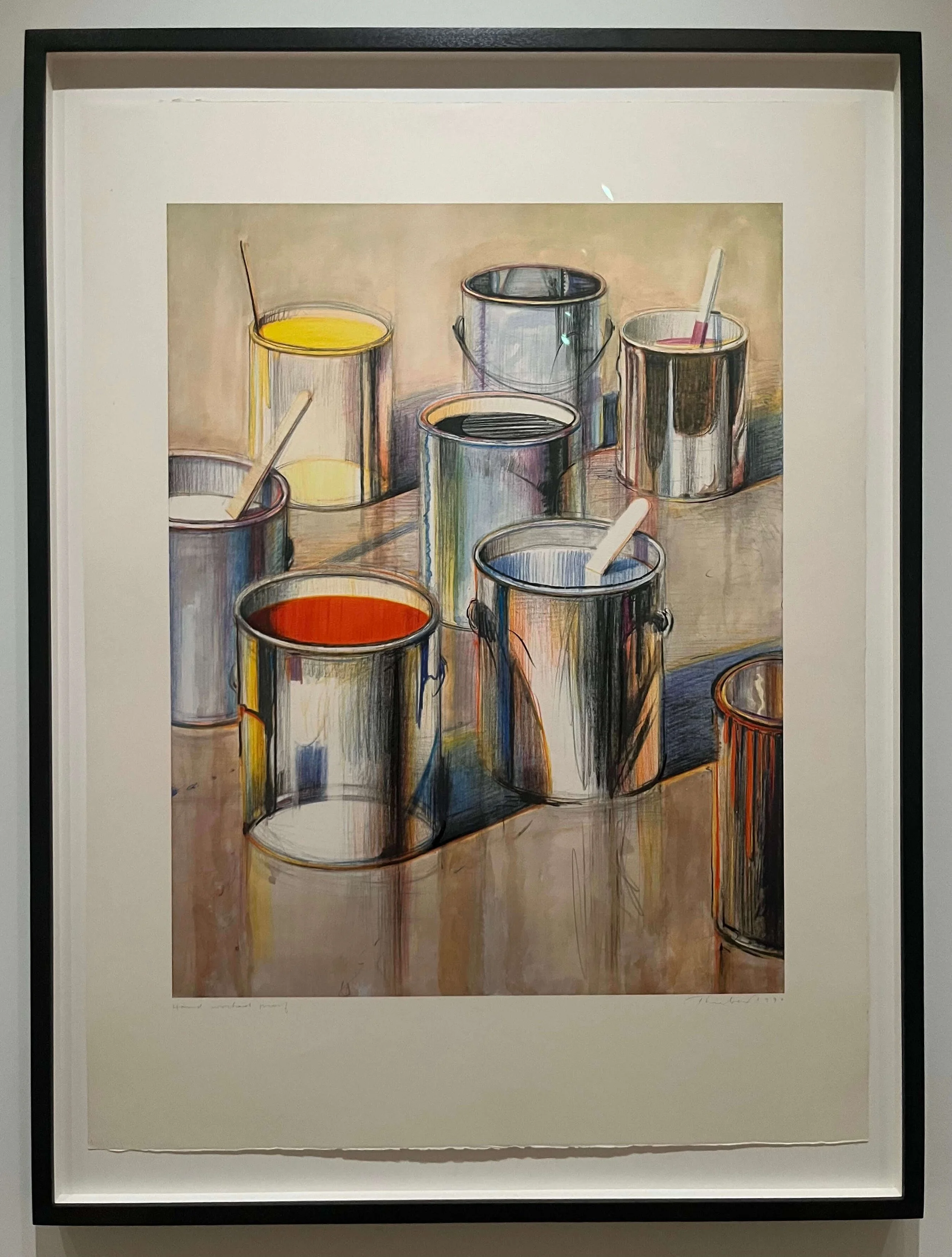
Wayne Thiebaud, Paint Cans
Looking at color
The Thiebaud exhibition, shown from March to August this year, spawned the current print show. “The reason we did the Printing Color exhibition is that we had the Wayne Thiebaud exhibition up. Color was such an important part of Thiebaud’s practice,” Lauricella explained.
Thiebaud is color. A painting of a white-frosted wedding cake is never pure white in Thiebaud’s vision. Pinks, aquas, blues, and oranges coexist to make us think, “white.”
Printing Color includes Thiebaud’s Paint Cans, a 1990 lithograph. It is an array of eight shiny steel gallon paint cans, some with paint visible through the open tops. It is classic Thiebaud, with darkly outlined cans arrayed to echo a Morandi still life or, perhaps, Thiebaud’s own pastries.
It is, fittingly, a lithograph about paint, owing something to Jasper Johns’s bronze piece about paint, his 1960 sculpture of a Savarin can stuffed with paint brushes. Thiebaud certainly appreciated the inherent humor. A Sacramento friend once saw the painter eyeing the dessert case at our local market. My friend mischievously asked him whether he was buying to paint or eat. With equal mischief, Thiebaud answered, “Why choose?”
His willingness to challenge the nature of art within the art can be seen in an easily missed aspect of Paint Cans. On the cans with red and yellow paint, there are shapes that make it appear that you see the bottoms of the cans on the inside, as though the sides of the cans are transparent.
Drawing a cylinder, an artist may sketch the top and bottom as corresponding ovals, forming a solid by connecting them with vertical lines. It’s elementary drawing stuff. To make it solid, one erases or colors over part of the bottom oval. Thiebaud didn’t.
Mistake? Doubtful. Thiebaud was meticulous. Crown Point Press’s Kathan Brown has written of how Thiebaud vexed Crown Point’s Japanese woodcut printer with insistence on perfecting a depiction of smoke in one of Thiebaud’s vertiginous San Francisco scenes. After hours of work, the printer said something his translator did not interpret. Thiebaud asked what it was. “Never do smoke again in a woodcut.” The can is not a mistake. Thiebaud is calling our attention to the illusion he has created.

Alex Katz, The Green Cap, Color woodcut, 310 x 455 mm
Intertwined story threads
The show’s prints are interconnected beyond the thread of timeline and evolution. Any viewer can find some of these ties for themself, like finding “Thiebaud” scratched in paint. Others require some background. For example, Tadashi Toda, the same Japanese printing master frustrated by Thiebaud’s smoke (not in this show), was also responsible for a work that is here, Alex Katz’s The Green Cap. This brilliantly colored woodcut of a woman in a swim cap has broad areas of almost uniform color, balanced with subtle shading that echoes a Katz painting. The show’s interpretive signage calls the woodcut a collaborative effort between Katz and Toda, who were working in Kyoto with Rezo Monjyu, a block carver. Their skill at translating Katz’s vision is perhaps at its apex in the woman’s delicate eyelashes, printed in a semitransparent white.

Alicia McCarthy, ZAPCRLM, Color aquatint, 51 x 51 in
“One of my favorite topics in the history of print is the role of the printer,” Lauricella said. She becomes enthused talking about the print shop skills embodied in a work that catches the viewer’s eye immediately upon entering the gallery. Colorful and outsized, Alicia McCarthy’s ZAPCRLM is named for the initials of the print’s collaborative team members.
Elsewhere in the gallery, lithographs by Éduoard Vuillard and Paul Signac share the printer Auguste Clot, the curator said. Lauricella’s doctoral thesis was on Clot. Clot’s deep lithographic knowledge, learned at a commercial press, benefitted Impressionists, Toulouse-Lautrec and other artists of that fin de siècle era.
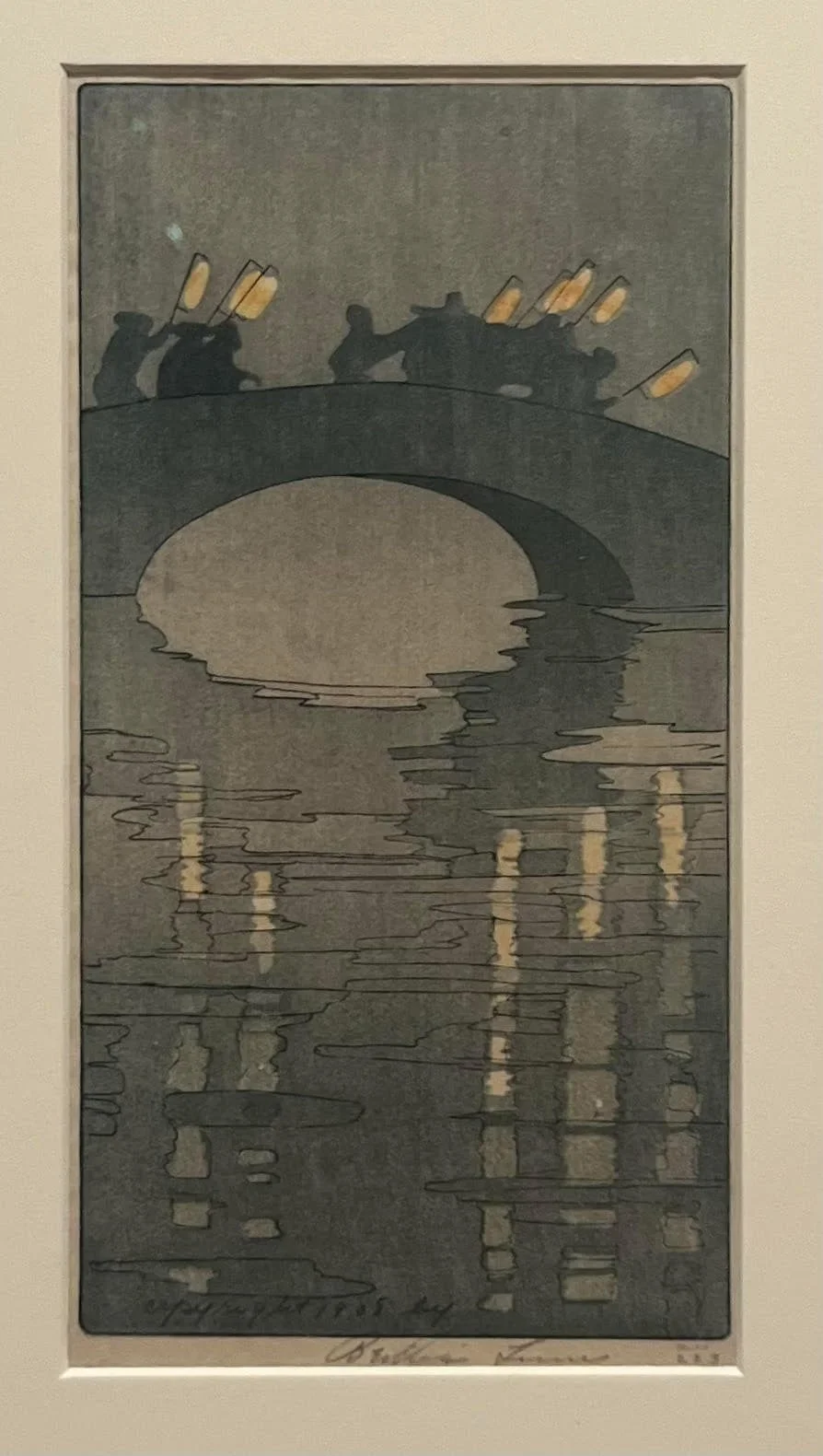
Bertha Lum, Lanterns, Color woodcut, 24 x 12.5 cm
These kinds of intertwined stories wind throughout the exhibit. Some are explicit, some less so. It is easy to see how Bertha Lum’s woodcut Lanterns echoes the bridges of adjacent Hokusai and Kitagawa Utamaro woodcuts. The flavor is Japanesque, though her vision is more focused and abstract. Similarly, Roy Lichtenstein’s Cathedral #4 is an obvious Ben Day take on Monet’s series of cathedral paintings (not here).


(L) Ruth Asawa, Desert Plant , (R) Willie Cole, Pressed Iron Blossom # 2, Color lithograph, 562 x 762 x 35 mm (in a shadow box)
Perhaps less obvious is the tie between Ruth Asawa’s warmly colorful Desert Plant, a variation her own monochromatic twisted wire sculptures, and the adjacent Willie Cole lithograph, Pressed Iron Blossom #2. Both prints were produced at the Tamarind Workshop. Tamarind seeks to preserve art lithography by bringing artists who work in other media to learn the process. “They find that printmaking can help them with their artistic practice in a different way,” Lauricella said. Paradoxically, printmaking restrictions can open artistic visions.

Josef Albers, Wide Light, Color screenprint, 432 x 432 mm
Asawa’s print also connects to the nearby Wide Light silkscreen by Joseph Albers. Not only does it share a similar color, but its tonal layering reflects Asawa’s debt to Albers, to his color theories, which she learned from him at Black Mountain College.


(L) Kiki Smith, Still, Color spit bite aquatint with flate bite and soft ground and hard ground etching, 673 x 787 mm (R) Jasper Johns, Bushbaby, 43 x 30 in.
Kiki Smith’s Still shares a commonality with Jasper Johns’ Bushbaby. Visually, they are very different, but both use a printing technique known as color spit bite aquatint. The signage for Still also evokes the narrative of the printer’s contribution. Smith’s printer provided a seemingly odd approach to achieve an effect the artist wanted.
Countless connective narratives are here in Gallery 22 - nationality, politics, commercialism, sexism, and others. I tie myself personally to some of the works by virtue of the artists I’ve known, works I possess, or my meager experience in printmaking. Each viewer will have stories to create from this show.
That’s my narrative, and I’m sticking to it.