
Michelle Fernandez, Paintings For Lou, And Friends Gallery
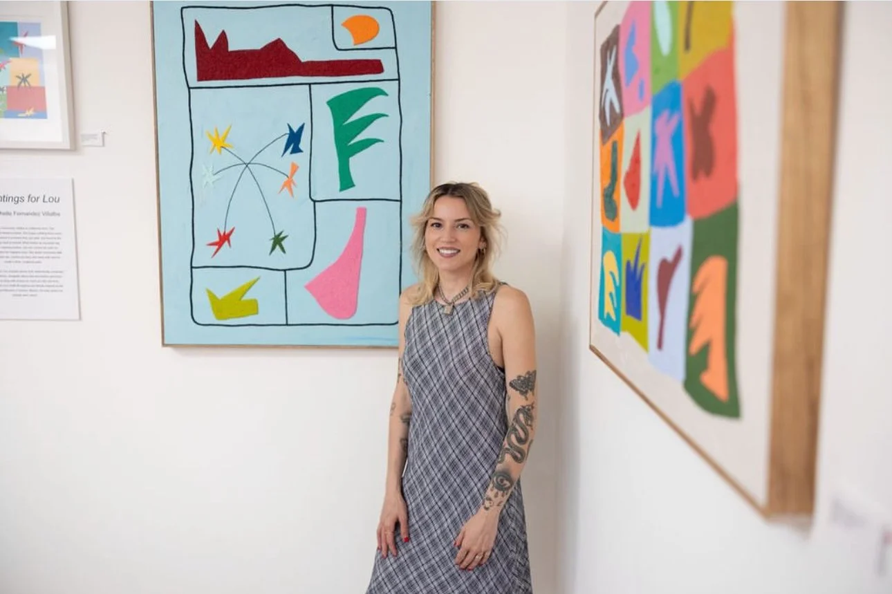
Michelle Fernandez at At Friends Gallery and Store, Santa Cruz. Photo by Onawa Pelham.
Paintings for Lou is an exhibition of Michelle Fernandez’s paintings currently showing at And Friends, an art gallery and shop in the Pleasure Point neighborhood of Santa Cruz. Across the exhibition, borders, stars, and abstract shapes appear again and again. Working with oil, primarily oil sticks, and adding sand to several pieces, Fernandez moves between works that are quiet and controlled and others that are dense and overwhelming. Despite these differences, the paintings feel very connected, in part because of the shapes and symbols that repeat throughout the show.
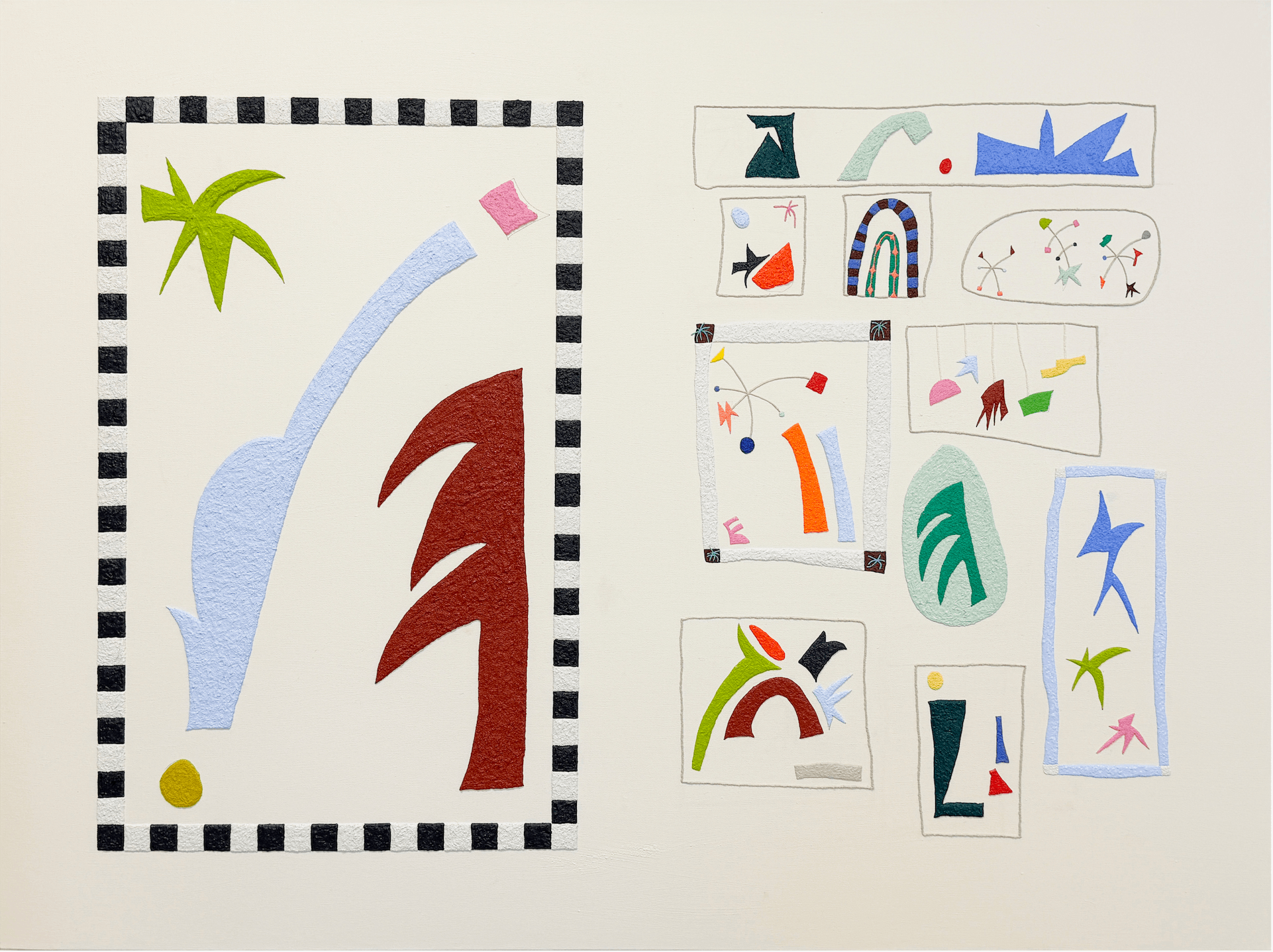
Michelle Fernandez, Painting for Lou, oil stick and sand on canvas, 36 x 48 inches.
The title piece, Painting for Lou, a 36 x 48 inch work in oil stick and sand on canvas, splits into two distinct areas. On the left, a large enclosed area sits inside a black-and-white checkerboard border, holding several oversized, simplified forms. The large blue shape could be a wave, or perhaps a river or path moving through a landscape. On the right, a grid of smaller compartments holds its own shapes and colors, some are possibly plants, trees or mobiles akin to those that Alexander Calder is known for, while others are more resistant to identification. There is something naive about these forms without them being immature; a sense of playful innocence perhaps? The checkerboard border separates the large forms from the smaller, compartmentalized ones and gives the piece the feeling of things being sorted and kept. The title names someone the viewer doesn't know, without explaining the relationship to Fernandez. It suggests something personal, while leaving enough unknown for the viewer to find their own meaning in it.
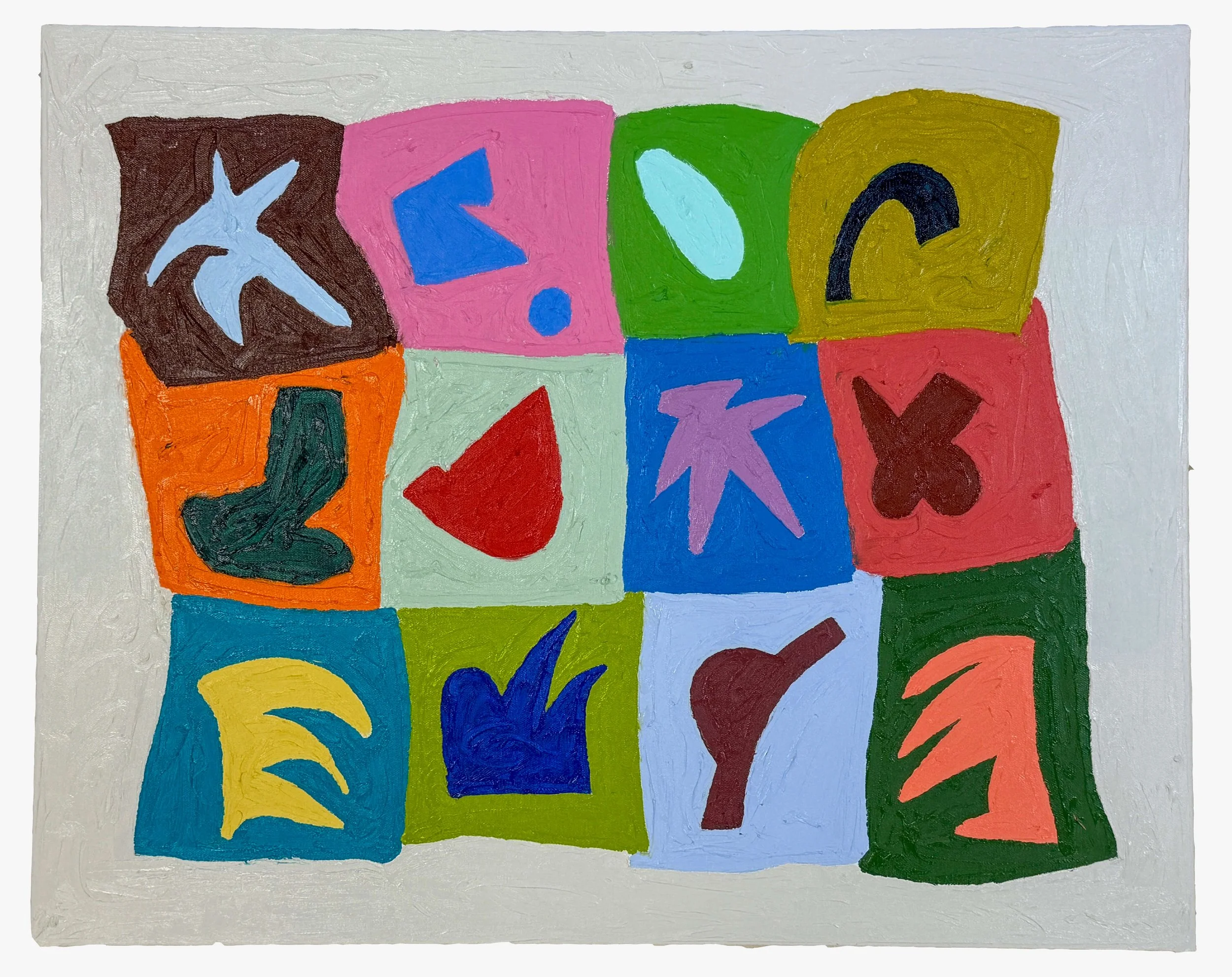
Michelle Fernandez, Overflowing Gently #2, oil-stick on canvas, 24 x 30 inches.
Overflowing Gently #2, a 24 x 30 inch oil-stick painting on canvas, handles the same idea but from a different angle. Twelve irregularly shaped color blocks are arranged into a loose grid, each holding a single simplified form, maybe a bird or plant, and other geometric shapes, are rendered in bold, varied color. The grid holds its form without feeling rigid, again embodying a sense of playful naivety. The blocks are uneven, the borders slightly off-true, the forms inside them not quite flush with their edges. The title's apparent contradiction, overflowing, yet gently, is reflected in the painting itself: controlled without being rigid, full without spilling over.
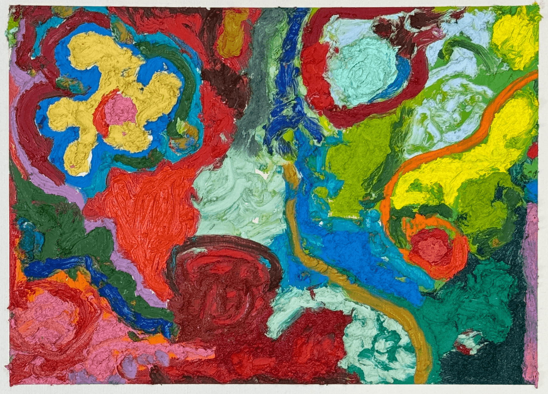
Michelle Fernandez, Burn Out, oil stick and sand on paper, 12 × 16 inches.
Burn Out abandons containment almost entirely. The 12 x 16 inch work in oil stick and sand on paper is dense with overlapping shapes. Reds, blues, greens, yellows, pinks, and oranges press directly against one another with no dividing structure between them. Forms surface and vanish, making it difficult to separate one shape from another. The painting feels less ordered, as if Fernandez returned again and again to the same surface, adding and covering as she went. The title works, to some degree, against the visual energy of the piece. Burn Out implies depletion, but the painting feels energetic and almost restless. Perhaps the title refers less to a loss of energy and more to a loss of control. There is a freedom in that disorder that feels very different from the more contained works in the show.
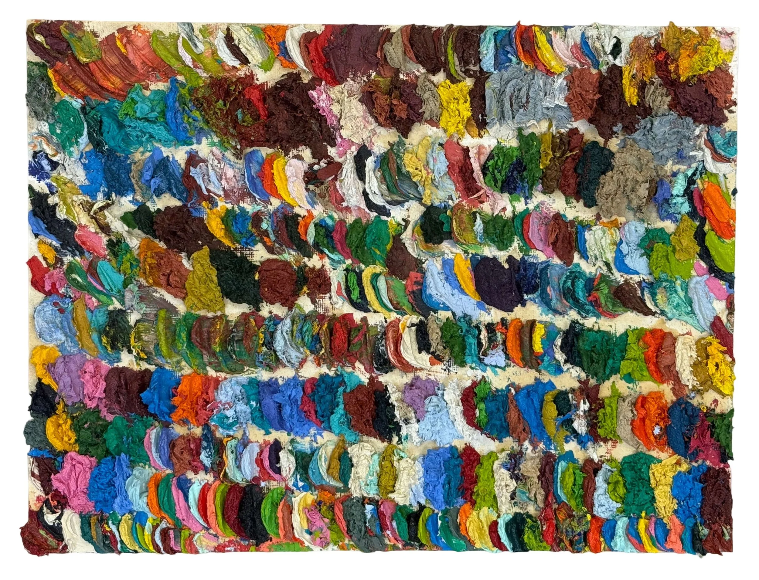
Michelle Fernandez, Killing Time, oil on paper, 9 × 12 inches.
That accumulation reaches its clearest form in Killing Time, an oil painting on paper, 9 x 12 inches. The painting is made up of swaths of impasto in varying colors, some solid, others mixed and transitioning from one color to another. The surface is almost entirely covered in hundreds of small, thick marks, no single one significant on its own, but together making up the whole image. There’s no picture to extract from the surface, only the process of making it, one mark after another. The title brings another possibility into the work. The accumulation could come from restlessness, from having time and not quite knowing what to do with yourself, so you keep making. But repetition can also be meditative. The same action performed over and over can quiet the mind and become soothing in itself. Set beside Painting for Lou, the contrast is clear. One separates its forms into bordered compartments, while Killing Time allows everything to build and blend together. One contains, while the other accumulates.
Across the show, Fernandez returns to stars, borders and familiar geometric shapes without giving them a fixed meaning. A star can simply be a star, or it can hold something more personal; abstraction leaves room for both. There is something charming and whimsical about these repeated forms and the boldness of her color, but there is also a deeper feeling beneath them. The paintings move between order and disorder, the recognizable and the abstract, leaving enough unexplained for us to make our own connections. Paintings for Lou is playful without being slight, and personal without shutting the viewer out. It is a show that rewards spending time with it, allowing the shapes, textures and small details to slowly reveal themselves.