
Helen Frankenthaler: A Grand Sweep, Museum of Modern Art, New York
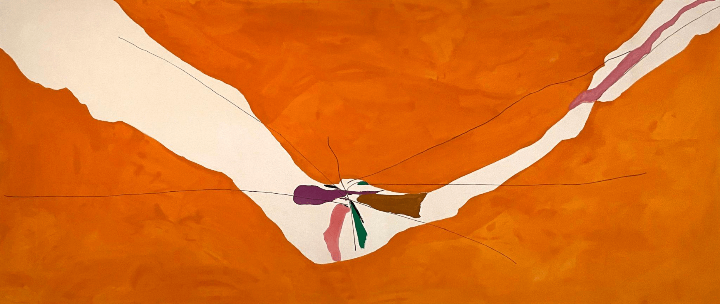
Chairman of the Board, 1971, Helen Frankenthaler, acrylic and felt-tip pen on canvas, 6' 10 x 16' 2
November 18, 2025 - February 8, 2026
By Scott Snibbe
What is lost when we claim an image "looks like" something else? And is it possible for a picture to resist any label at all? These questions came to mind as I and a friend strolled past five breathtaking paintings now on display at New York's Museum of Modern Art (MoMA) in Helen Frankenthaler: A Grand Sweep.
We had planned to visit more of the museum's galleries, but as we finished admiring the last of these paintings, my friend suggested we return to the first. We ended up taking laps around MoMA's vast second-floor atrium, again-and-again appreciating five grand highlights of one of postwar art's most powerful painters.
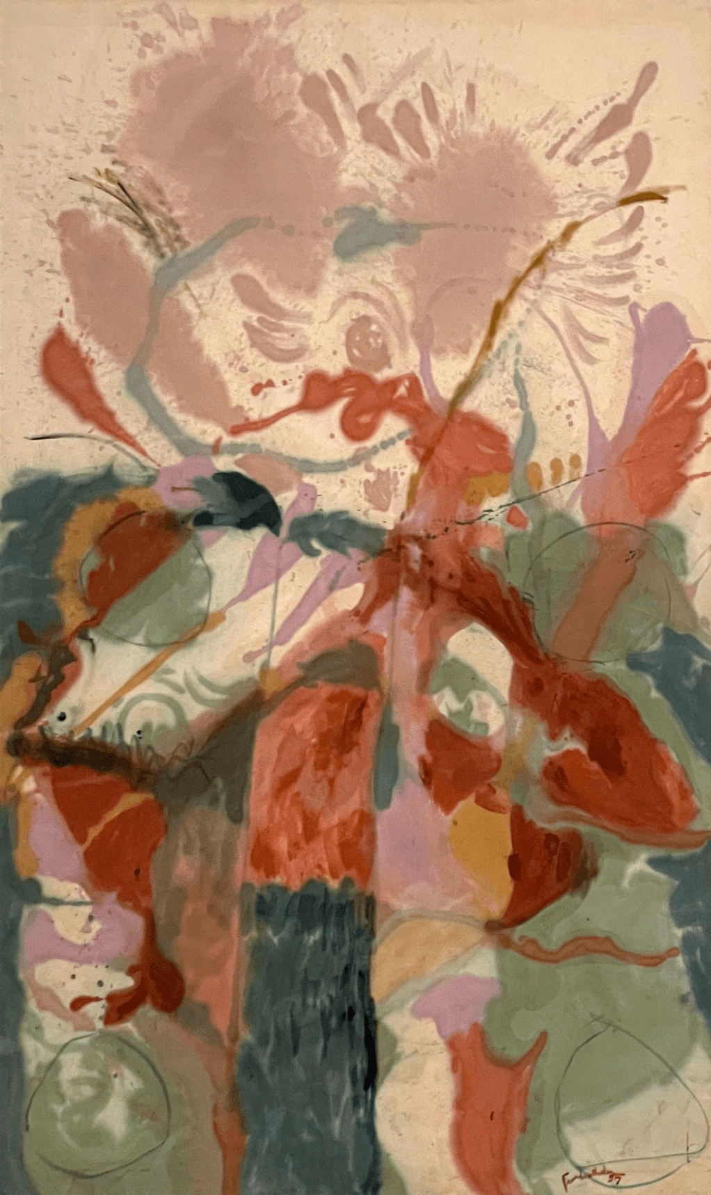
Jacob's Ladder, 1957, Helen Frankenthaler, oil on canvas, 9' 5" x 5' 10"
The first painting, Jacob's Ladder (1957), carries an unmistakable biblical reference—unusual for an artist who mostly spoke about her work in formal, technical, or experiential terms. Like many cosmopolitan New York Jews of the 1950s, Frankenthaler's public life was secular and modern. Yet this work refers to one of the Hebrew Bible's enduring stories: Jacob's dream of a ladder connecting heaven and earth.
The painting's muted sage and moss strokes on its lower half clash with dried-blood bolts. These dissipate into the raw linen sky above, stained with exuberant pink splashes I couldn't help but see as wings. Heavily worked in multiple layers, this abstract expressionist canvas is knottier than Frankenthaler's later luminous color fields—a testament to its creator grappling with a new idiom.
My friend and I debated an odd feature for some time: four circles sketched at the canvas's lower corners and midway along its sides. They stand apart from the painting's reality, like a critic marking areas that still need work. I wonder if she meant it this way—that the painting was an unresolved struggle, mirroring humanity's erratic ascent toward higher aspirations.
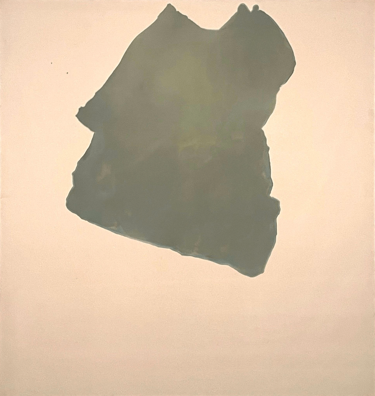
Commune, 1969, Helen Frankenthaler, acrylic on canvas, 9' 3 1/2" x 8' 9 1/4"
Commune (1969), hung adjacent to this painting, is its polar opposite: a huge unprimed canvas upon which a muted turquoise continent floats, disconnected from its edges—and from anything else. A decade further into Frankenthaler's career, this painting shows mastery and originality beyond the Kandinsky-like lyrical abstraction of the earlier work. It takes guts—and discipline—to make a painting like this: guts to perform her irrevocable stain-pours, and discipline to step away just before it's ruined.
I respected this picture, but it's unmoored cool left me unnerved. Then, even worse, the unnameable shape resolved for me—into a blouse—a turquoise one tossed onto the floor, awaiting laundering. I regret saying this, as I did after I shared this conceptual collapse with my friend, who complained that she'd never again see the painting as anything else. In an instant, its central shape had transformed from unnameable abstraction to indelible label.
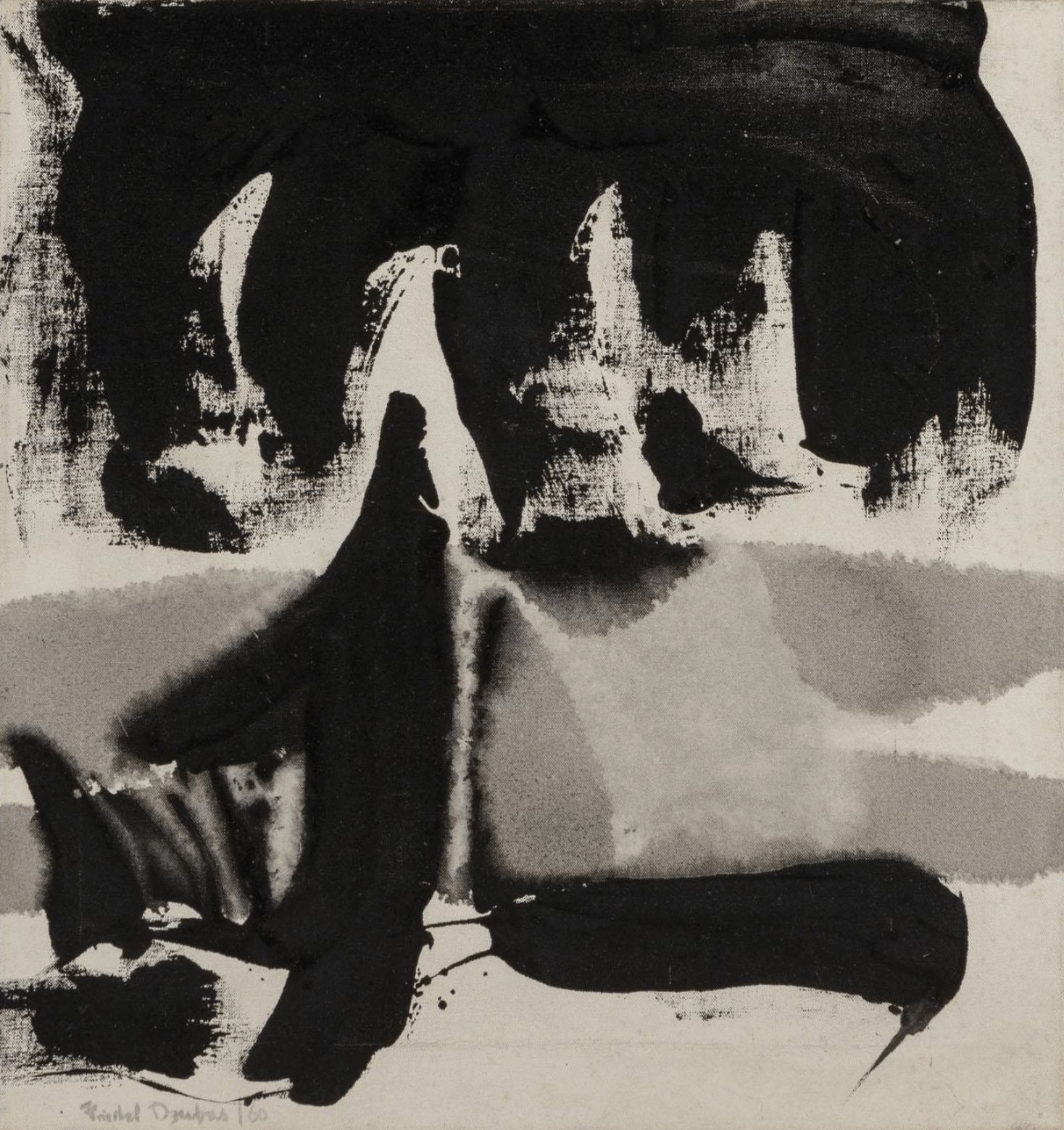
Untitled, 1960, Friedal Dzubas, acrylic on canvas, 20" x 19"
The first perceptual collapse I experienced like this occurred when I was a ten-year-old boy. My parents owned an abstract painting by one of Frankenthaler's early studio mates, Friedal Dzubas, who had been a friend of my grandmother. His painting, Untitled (1960), hung on our wall for years—about the size of a sidewalk square, executed in rough strokes of nonobjective black abstraction. Abstract, that is, until my younger brother and I suddenly recognized in it the face and armored torso of a medieval knight. We shared our interpretation with our parents, and from that day forward, none of us could unsee the straight-backed nobleman gracing our living room wall.
I commit these abstract art sins of naming the unnameable in service of a greater good, which is to illuminate the nature of the labels we attach to anything. Philosophers and cognitive scientists describe the effect of cognitive penetration, in which concepts infiltrate experience itself. A label, once applied, gets indelibly impressed upon perception. Buddhism describes the process similarly, but claims that we each still experience a first moment of perception, however brief, of unfiltered reality. If we work at it, we can recognize—and sometimes extend—the moment before habitual designations intrude.
This type of meditation is called emptiness or dependent arising, and one day, our meditation teacher gave us an exercise to strip away the conditioning of culture, language, education, even evolution—to see reality closer to how it truly is.
This meditation isn't done with your eyes closed, but with a pencil and a scrap of paper. Take the paper and draw on it three strokes, like this:
A
Now, try as hard as you can to see those lines only as strokes instead of the first letter of the Roman alphabet. Can you do it? I find it nearly impossible.
My teacher says that it took him a week or so to dissolve the "A" back into lines. Yet there was a time when we all saw it that way: before we knew the English language, the alphabet, before we could speak, before we had terms for much of anything at all except "mama."
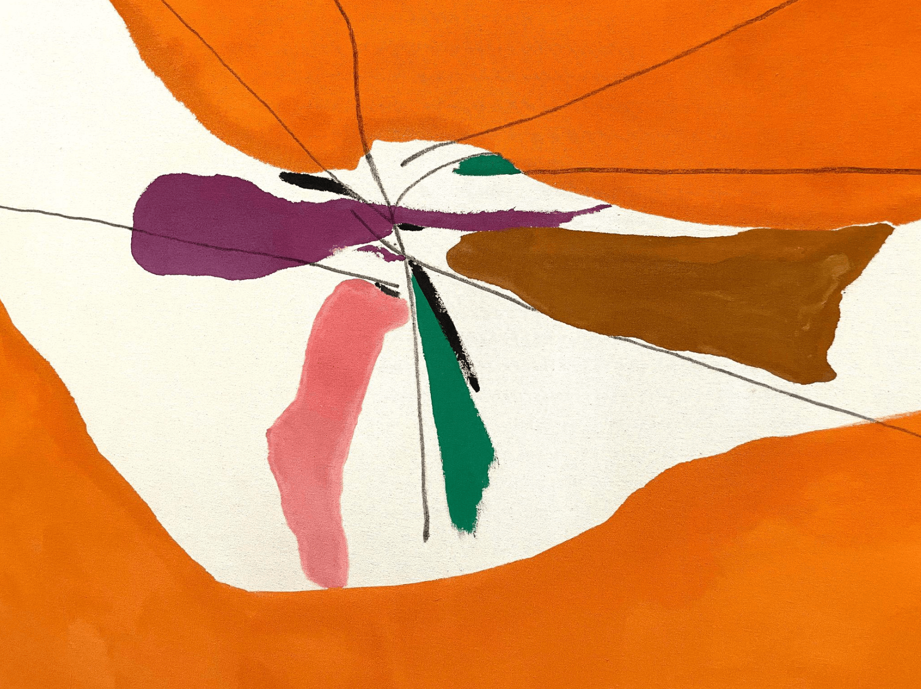
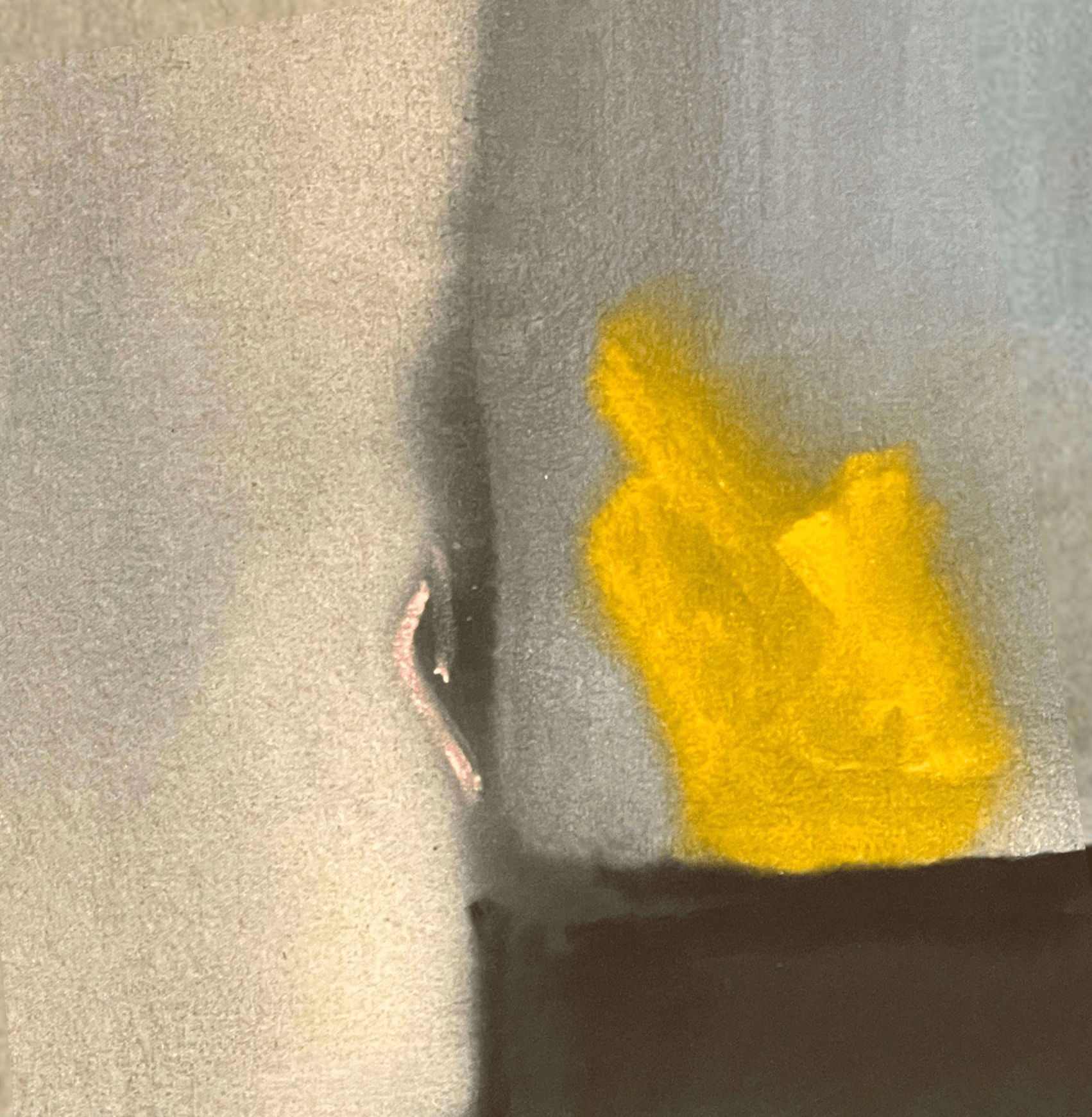
Chairman of the Board, 1971, Helen Frankenthaler (detail)
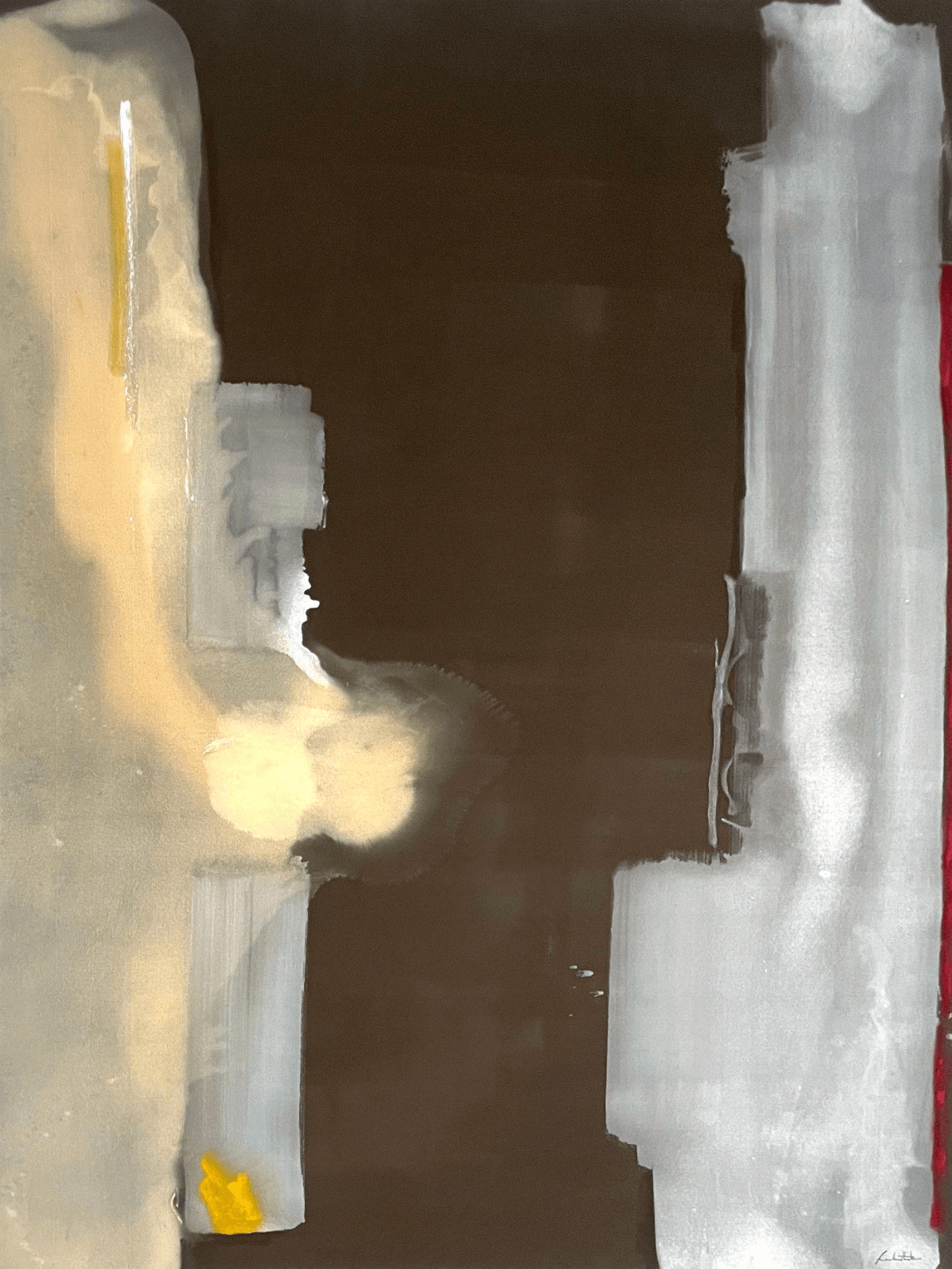
I think this pre-conceptual perception is what painters like Frankenthaler chase—a herculean task that her next painting around MoMA's atrium pulls off with aplomb. Chairman of the Board (1971) is an enormous, predominantly orange canvas. A raw fault line arcs through its middle, revealing a bare linen crevasse from which blossom purple, brown, green, and pink blooms. Feminine, alluring, creative (or violent?)—weighed with a jarringly masculine title—the work suggests that the universe has even more to offer us than we have yet imagined. The painter's own words indicate that she may have been as jolted by its beauty as we are: "anything original is as much of a shock to the artist as anyone else."
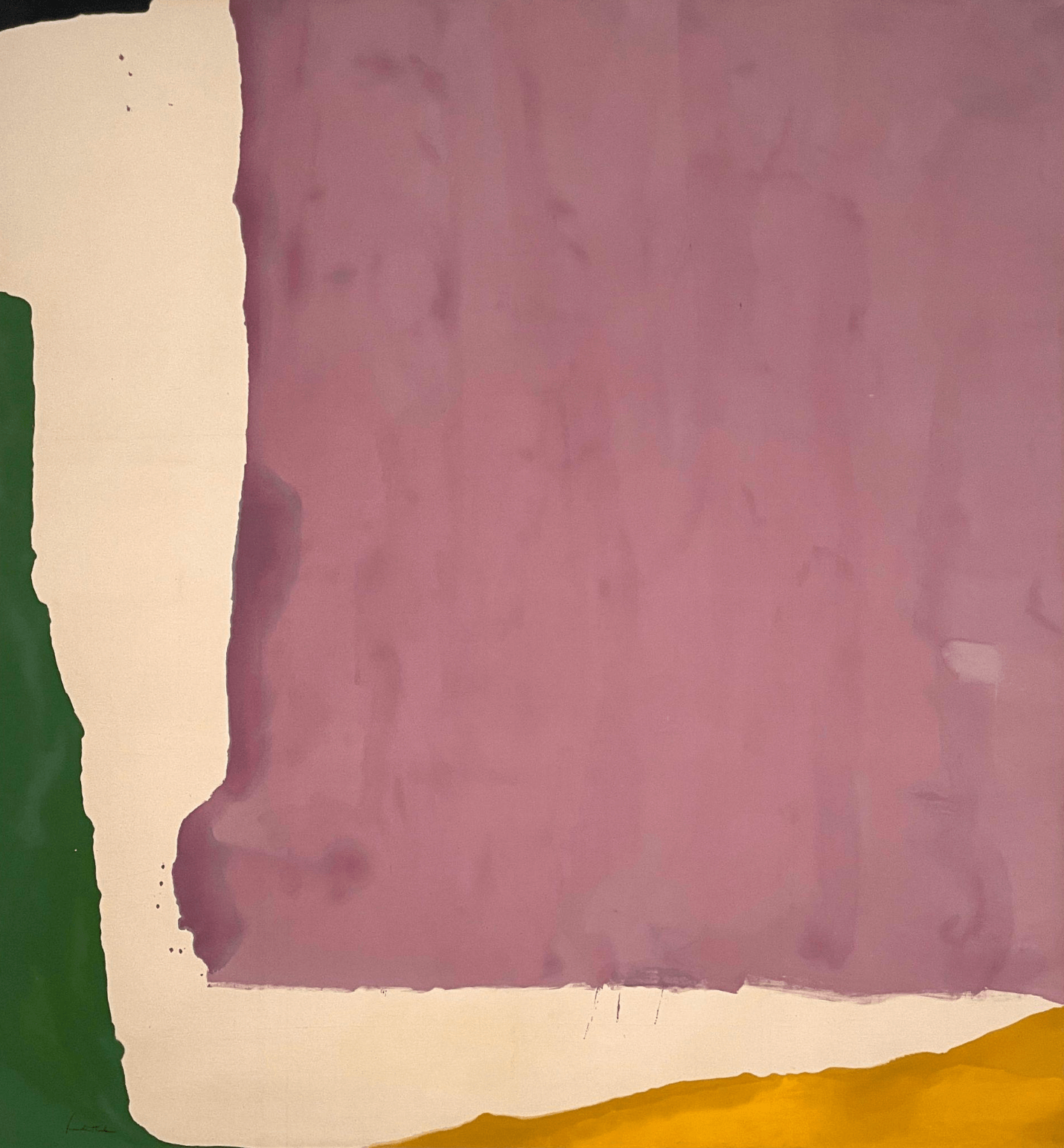
Mauve District, 1966, Helen Frankenthaler, acrylic on canvas, 8' 7" x 7' 11"
Mauve District (1966) is a smaller painting (if you can call it that, at 8 feet by 8 feet). A vast, uneven expanse of purple-stained paint takes up the majority of the canvas, extending to the crisp borders of its top and right, then tears unevenly across left and bottom in darker spills, splatters, and rough strokes that outline a plum continent fringed by an unpainted canvas strait. Offshore, green, yellow, and black promontories jut in from the canvas sides, cropped by the painting's edges into terra incognita.
Frankenthaler and her admirers spend much of their time talking about the technique that produces such unique marks: her innovative way of painting horizontally on the floor with thinned, mixed paints that stain and separate in barely controllable bursts. Of the five in this show, this painting best conveys her grappling with material.
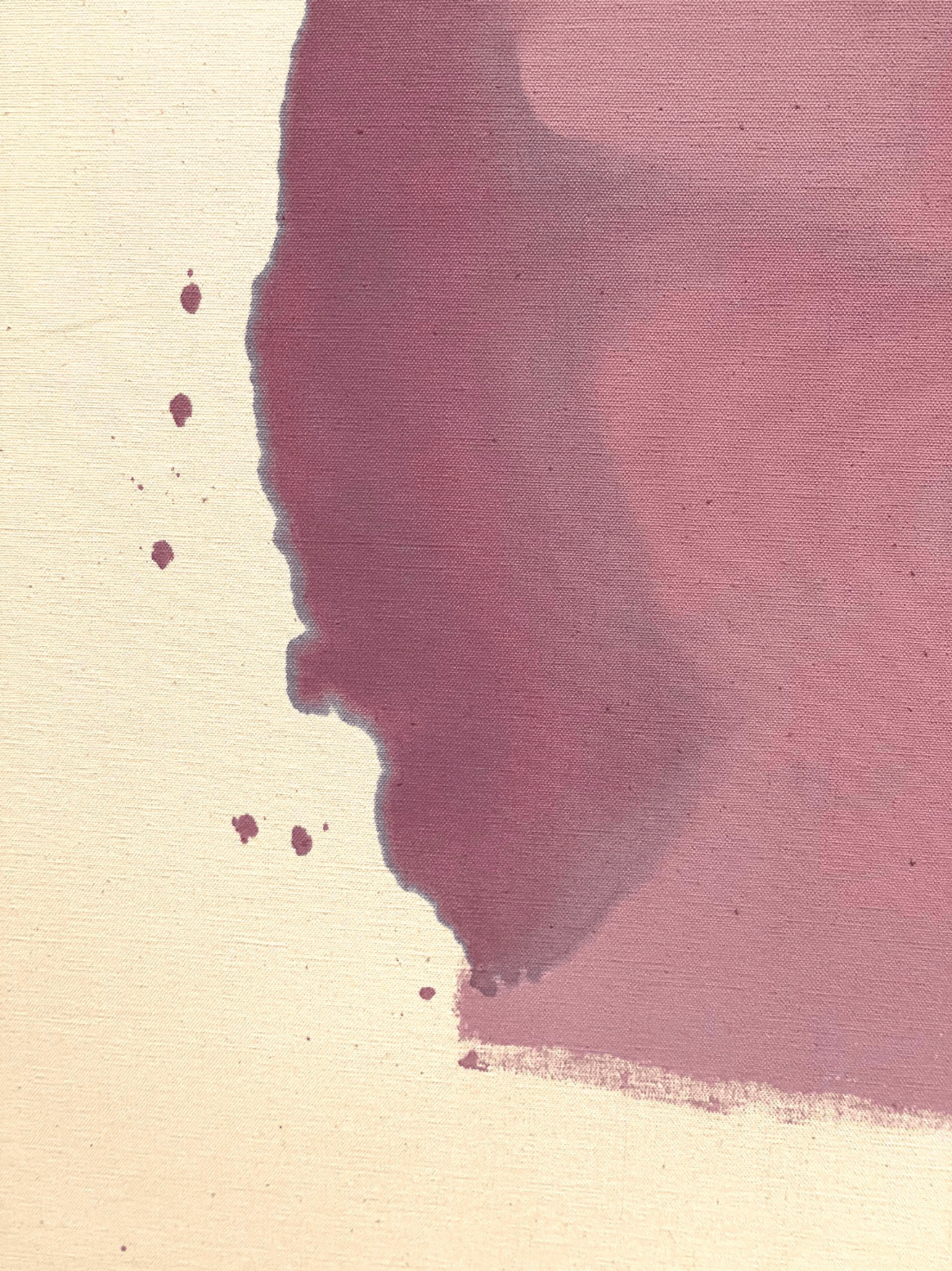
Mauve District, 1966, Helen Frankenthaler (detail)
My friend and I spoke about the questions Frankenthaler's restless work provoked in us, and one of the biggest was how many she threw away. Our musing ranged from "most" to "none." But now, discovering the artist's own words, I find the answer somewhere in the middle: she confessed to making "a lot of bad pictures and a lot of radiant pictures."
Toward Dark, 1988, Helen Frankenthaler, acrylic on canvas, 9' 10" × 7' 4"
The last picture in the show comes from Frankenthaler's later period, Toward Dark (1988). This overcast painting reminds me, uncomfortably, of my grandmother's. My father's mother was a minor abstract expressionist who I met only once—when I was a toddler enjoying my own preconceptual perceptions. She was a troubled woman who worked through her demons with paint—until she didn't—taking her own life in 1973. Because of these echoes, at first, I didn't like this painting at all. But upon repeated viewings, tiny details in it came to make it work for me: in particular, two minute pink strokes in the canvas' corner that suggest hope even in one's darkest moments.
Toward Dark, 1988, Helen Frankenthaler, (Detail)
Among the show's brief body of wall text, Frankenthaler refers several times to her work as the product of a continuous dialogue with her body: "I am essentially true to my own wrist or signature; a continuity with visible changes and developments along the way." And, "I think in all my painting you can see the signature of one artist, the work of one wrist."
Well, that is some wrist. Yet the insistence of Frankenthaler (and many of the critics and curators writing about her), on asserting a stark materiality upon such unlabelable, and often spiritual works frustrates me. My own experience of her work has been the opposite: feelings of ineffability, the beauty in the unknowable, inexpressible, immaterial, and invisible. Even before I became a Buddhist, there was something primal and true I felt before her canvases—that they were, perhaps, pictures of the way things really are, rather than the way we see them.