
Don Farnsworth

Don with his wife Era
Donald S. Farnsworth, born in Palo Alto, is an internationally recognized artist and master printmaker celebrated for advancing both handmade papermaking and digital innovation. He earned his B.F.A. from the San Francisco Art Institute (1974) and M.A. from UC Berkeley (1977). Founder of Magnolia Editions in Oakland (1981), Farnsworth has collaborated with renowned artists including Kiki Smith, Hung Liu, Chuck Close, Bruce Conner, Faisal Abdu’ Allah, William Wiley, Enrique Chagoya.
His works are in major collections such as the Achenbach Foundation, Brooklyn Museum, Smithsonian Institution, and Fine Arts Museums of San Francisco. Farnsworth has created techniques for making electronic weave files, direct-to-plate photogravure, and mixing acrylic inkjet with traditional woodcut and etching, showcasing a continuous exploration of the intersection between art and science. His pioneering techniques in electronic weaving, photogravure, and mixed-media printing exemplify his lifelong fusion of art and science, tradition and technology.


(L) Bird Skin Tray I, 2007, pigmented inkjet on rag paper, 22.5 x 40 in.
(R) Donald Farnsworth, Counterpoint/Triumphal Arch II, 1989, mixed-media drawing,collage, and gold leaf on lithograph, image: 29 1/2 x 22 in. (74.9 x 55.9 cm), Smithsonian American Art Museum, Gift of Nancy Genn, 1991.191
The following are excerpts from Don Farnsworth’s intreview.
Hugh Leeman: Your artwork at the Smithsonian, with drawing, collage, and gold leaf appears strikingly different to the work shown at the Nevada Museum of Art where you showed your specimens series using your own bugs, which is a true testament to the breadth of your creativity. Can you talk about the journey from one series to the next that arrives at such diverse artistic outcomes?
Don Farnsworth: My work at the Smithsonian is a mixed media, handmade paper collage with lithography and watercolor made in 1989. I moved away from work with architectural content shortly after that Smithsonian piece was made. Many successful artists have been more consistent in their style, approach, and content than I have been. Over the years, at Magnolia Editions and earlier at Editions Press, I collaborated with hundreds of artists working with each of them to create pieces. In that process, I have been exposed to numerous techniques, ways of thinking, and the unique approaches that artists employ in their practice. Because of this exposure, I've developed a scattered way of approaching my own works. Art ideas are like puzzles or equations that need to be solved, and I have the luxury of reaching back and using the art-making experiences stemming from my collaborations over the last 50 years.
The Nevada Museum exhibition (the Darwin Specimens series) came about because I was frustrated by the religious dogma that denounced Darwinian theory. I wanted to create works that showcased the majesty of nature, carefully juxtaposed with Charles Darwin's text. However, there were numerous problems to overcome in order to bring the idea to fruition. For example, to get the depth of field of something small, like an insect, is difficult. When you take a photograph, the smaller the object, the less depth of field you have. So, you can usually get one surface in focus, such as the back or wings, but the legs and feet will be out of focus.

Origin:Specimens I, pt. 1, 2007
pigmented inkjet on rag paper
30.75 x 26.5 in.
edition of 24
For the initial phase of capturing the subject, I collaborated with Ben Blackwell, a renowned photographer. We used his high-resolution BetterLight Scan Back attached to a large format camera —scanning, instead of film, skipping the interpretation of darkroom chemicals. We took multiple images (captures) at different focal lengths, and I put them together, working many hours in Photoshop to put the focused layers into place, then "hand-painted" the cast shadows, and collaged the insect (or object) with cast shadows on the Darwin text block.
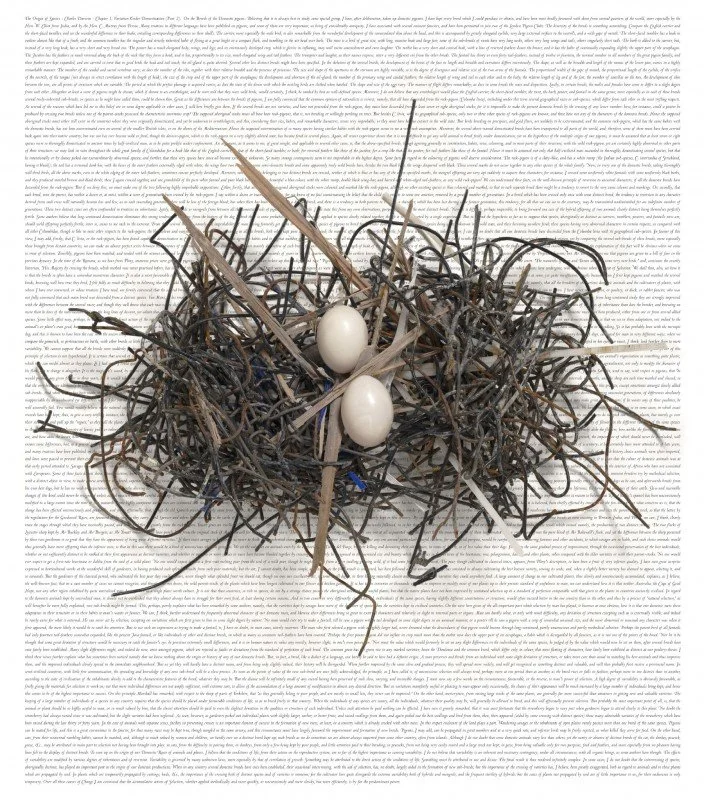
In many cases, it was extremely difficult. The Bird Nest piece, for example, where the shadows and negative spaces were complex. Separating the nest from the background was painstaking and laborious. The Bird Nest piece in the Nevada Museum exhibition came from a moment when Ben and I were going through the cases of specimens and photographing bird skins using the cumbersome and extravagant setup of a large format camera scan back, lights and computers. We were going directly from the object, a bird skin, directly through the lens to the back of the camera. Everything had to hold still for three minutes while the BetterLight Scan back would scan in three passes red, green and blue light. This setup provides a very detailed and direct capture of an object.
Origin:Specimens I, pt. 2, 2007
pigmented inkjet on rag paper
30.75 x 26.5 in.
edition of 24
At one point, a volunteer walked in holding a piece of plywood with a bird's nest made out of construction materials from the San Francisco science museum construction site in Golden Gate Park. At the construction site, she found this odd nest. The nest was made out of heavy-duty wire, pieces of zip ties, and splinters of plywood. The bird had built the nest from the available materials foraged from the construction site of the museum and laid her eggs. It was fascinating; we asked and received permission to photograph it then and there. It has been suggested that artists will do anything for content, looking around for inspiration at every moment in their lives. And that was a moment when content presented itself because I was at the right place at the right time.
When Era and I were in Japan, we had access to Mount Fuji on a beautiful, cloudless, sunny day, not a common occurrence. We had a local guide drive us around the sacred mountain, and we took hundreds of photos from all angles, not exactly sure what we might do with these images other than the concept that these were contemporary views of the mountain. We thought it would be fitting to create 36 contemporary views of Mount Fuji, similar to those of Hokusaiand others, because the opportunity presented itself and the content was available. Era's mother had collected woodcuts in Japan after WWII. Back home, we scanned the woodcuts and incorporated the textures into the work via digital collage using the photos for reference. Since our return, we have made 60 works, compiling them in a book "Diary of a Journey" Mount Fuji. This book collaboration takes the goddess Fuji on a world tour. It's not surprising that one must be in the right place at the right time, with the right tools and techniques at hand to translate content into compelling imagery — or something interesting enough to view.

Era Farnsworth, 2023
On the bus to Parma Hospital
HL: Tell me more on this idea that artists will do anything for content.
DF: The same thing happened to me in Parma. There I was, practically on my deathbed, thinking, "Hey, look at all the stunning content around me. If I survive, it would be wise to have taken portrait photographs of my caregivers (content). That way I can use the photos as a reference for drawing their portraits on the Renaissance handmade paper I had been recreating back home at Magnolia's paper studio."
"In gratitude and as a sincere thank you." This became my mantra to myself while I was near death in Parma. The physicians and staff at Maggiore Hospital in Parma saved my life with many blood transfusions, hundreds of blood tests, multiple scans, and love, and so it was worthwhile to get that content in that moment.
It's important to realize that we all think, and we all like to believe—and it's true—as an artist or in any walk of life, we're standing on the giants of humanity —the great thinkers and creators that went before us. We didn't invent watercolor. We didn't invent printmaking. We didn't invent drawing. Nor did we invent paper. And we'd like to believe, as we work in the arts, that the art supplies and what we were taught are the tools and great techniques that went before us, handed down, and that we now have those in our repertoire and can use those to create our own works.
Don making paper
The truth is, schools may not be teaching you or exposing you to the actual techniques and materials used in earlier times. Historic imagery can always inspire. I'm not saying that that's not possible, to look at abstract art, impressionism, Renaissance frescos, or cubism and say I'm going to branch off from that. But the materials they use might be different than the materials we're using today —corporate-made art supplies don't always respond to mark making in the same way as materials from, say, the Renaissance.
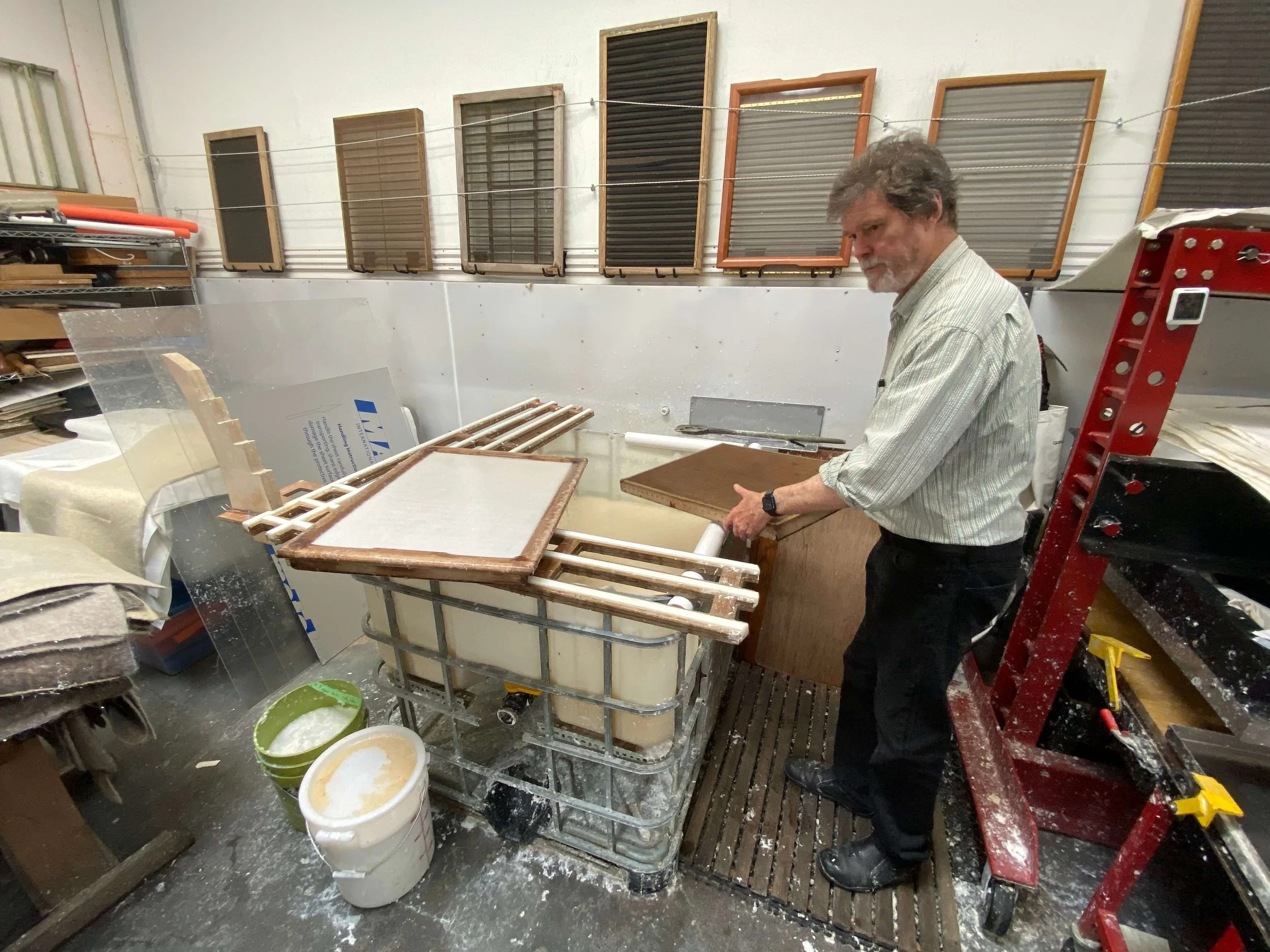
And that leads me to my adventures in recreating Renaissance handmade paper. I had been teaching students how to make handmade rag paper in the printmaking department at California College of Arts and Crafts in the 1970s, and I thought I was exposing them to the traditional techniques of making rag paper. It's true. I had traditional laid paper moulds. We were indeed using rags, but we were using the wrong kind of rags. We beat our rags to a pulp. But I later found out that, in fact, I was overprocessing (beating) the rags. In the Renaissance, they beat their pulp as minimally as possible so that the water would drain out of the paper mould as fast as possible. So they could make 1,000 sheets or more per day. If you process fibers for too long a duration, you have to wait for the water to drain out of each sheet before you can transfer it to a felt (couché). Also, if you highly process pulp, the finished sheet shrinks more, and the felt hair marks that I love from the Renaissance paper disappear.
Using felts made of wool with DNA dating back to the Renaissance—form sheets and squeeze them between these felts—and you might create a Renaissance-style paper. But if you've processed your fiber incorrectly, the fabulous felt hair marks will not appear; the marks that influenced every stroke of the Old Masters' chalk. It took me years to figure out how to process rags correctly and how to size the sheets with hot animal skin glue in the correct percentage to arrive at a final sheet worthy of holding a chalk mark.

Self Portrait, 2023, graphite, chalk, and mixed media on handmade paper.
HL: Let's go back and give some context on this. You mentioned the Parma portraits, you mentioned the paper making. You have previously shared portions of this life-changing experience that you mentioned in very brief here that took place during COVID with your illness. There's an incredible recovery, and then new artwork that's exhibited at the Boca Raton Museum of Art. So, for those people who have no context on this, you're speaking at Oxford University on the papermaking that you've just been sharing on. After this, you're heading to Italy. You're going through Europe on a vacation and you begin to feel sick. Then what happens next ends up changing your life. Can you share that story for people who have no context?
DF: Sure, I'll start from the beginning; I gave a talk on Renaissance paper at the Paper Foundation in England, after which Era and I traveled to London to look at old papers at the Victoria & Albert Museum study room, then Paris, Gap, Rome, and Parma. All went well until Paris, where I started feeling unwell. We took the train to Gap in the French Alps. There we met up with Oakland artist Squeak Carnwath and her husband, Gary Knecht. Era had found a travel package where we could all go hiking and experience gourmet meals at the same time, in the French Alps. But on my way to the hiking portion of the trip, I came down with COVID. I gave it to Era and to two other friends, Tom and Jan Andres. We sequestered in Gap, and they all recovered quickly. I, on the other hand, didn't recover. I was testing negative, but my shoulders and neck were aching and so sore I couldn't hold my head up. I had to lie in bed, and I lost my appetite. On the bright side, I was testing negative. So, we continued our trip and arrived in Italy , taking the train to Rome. In Rome, I stayed in bed while Era went to the museums and brought food home for me. Sadly, I had no appetite. More and more time was going by, and I wasn't getting better. Once settled in Parma, we looked up my symptoms on the internet and found that sore shoulders are a possible indication of a heart attack. So we called the local hospital, and they said, "Well, come to the emergency room tomorrow morning."
We took a cab the next morning. I collapsed onto a gurney, and they ran tests and reported, "Well, your heart's fine, but you have pneumonia, scar tissue in your lungs, Covid, and we must give you blood in the next few hours because your hemoglobin is extremely low." Hemoglobin is the iron component of your red blood cells that makes possible thedistribution of oxygen to the trillions of cells in your body. And that's why my muscles were aching and why I was exhausted with no appetite. The cells in my body were not getting sufficient oxygen.
They eventually found me a bed in the Covid ward and started a transfusion. How bad could it be? Three weeks and 10 bags of Italian blood later, I became more Italian, craving pasta. In the hospital, the kindness of the doctors and the empathy was beyond anything I had experienced in the States. It was as if their goal was to make me feel comfortable and cared for, whether I lived or died. Testing me for every possible ailment, they left no stone unturned.

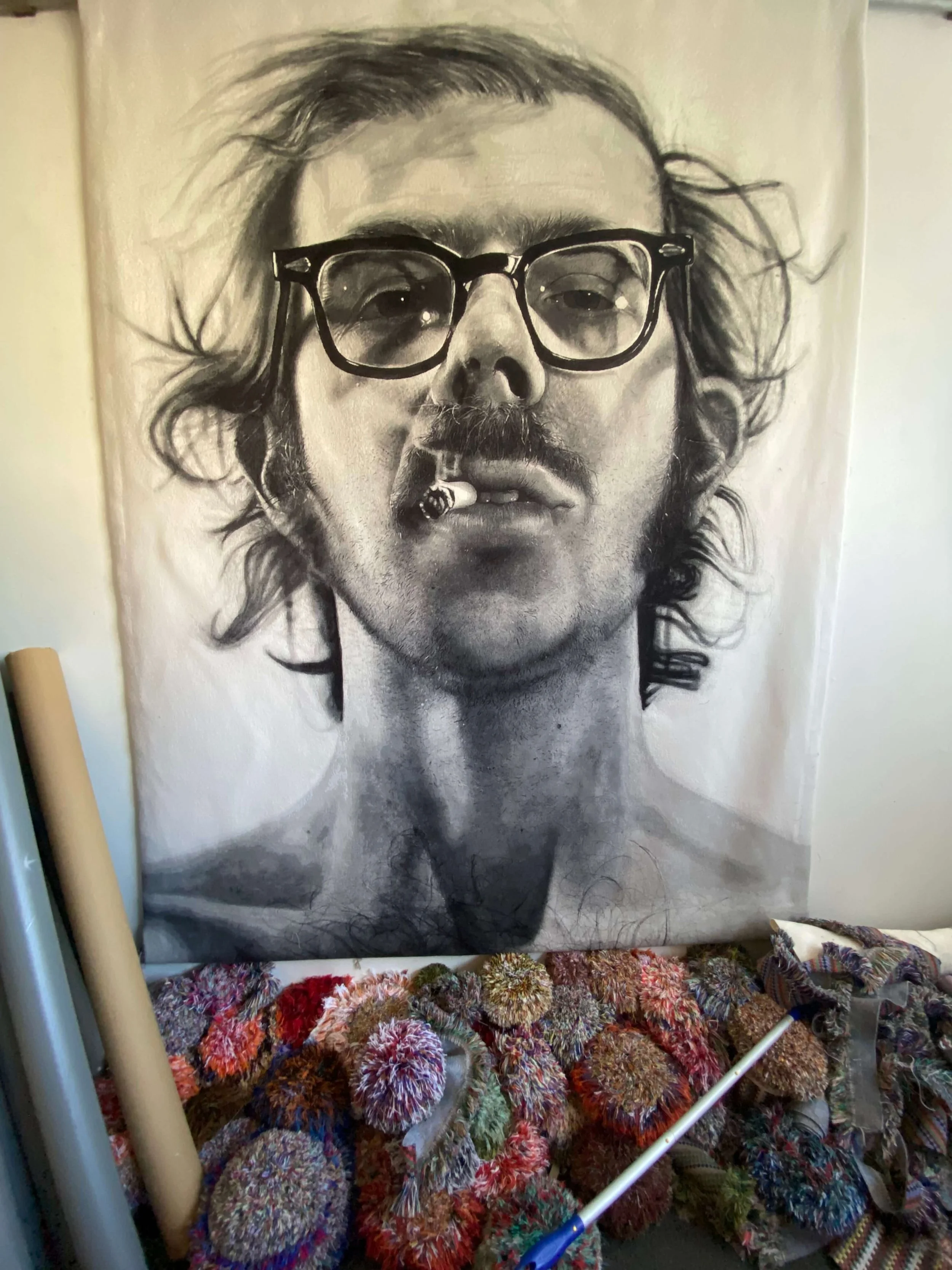
Giancarlo, Patient (Roommate) 2023, graphite, chalk, and mixed media on handmade paper.
Feeling grateful, I wanted to write a love letter to my wife and to these individuals in the form of portraits. What better thank-you than portraits of my Italian caretakers drawn on Italian Renaissance-style paper, the very paper that we had been recreating these last eight years. After all, there I was in Italy. So, after each blood transfusion, I had the energy to get out of bed and take their photographs. The following day, my energy (and hemoglobin) would slip away. Early on and on bad days, I could just lift my iPhone and take their photograph when they stood at the foot of my bed. When I was able to stand up, I asked them to look a certain way. I told them to stop smiling. Every time you take somebody's photograph and you want to draw portraits, you don't want them with a big grin. And they were all so sweet and kind. They always had a grin, and I used sign language and words and made funny faces to get them to stop smiling.

Inside Magnolia Editions
And then, still not knowing whether I was going to survive or not, I had enough energy at some point to get my computer and to strap my power brick to the outlet high up on the wall behind my bed with lengths of surgical tape. At that point, I was able to modify and solarize the photographs in Photoshop.
Solarizing is a tip of my hat to Man Ray. He was in the dark room with his wife, Lee Miller, when a mouse ran over Lee's foot—she was wearing sandals. In a panic, she turned on the light, which exposed what was in the developer tray. She, realizing her mistake, turned the light off, and she said, "Well, let's start that one over again."
Man Ray said, "No, let's keep going." In this way they discovered and developed their own style of solarizing photos. These days, in Photoshop, we can shift the values with "curves". We can switch highlights, shadows, and shadow highlights. Showing my results to the doctors and nurses, and seeing them get excited, was a thrill. I hadn't done one bit of drawing, but I had experimented with the images, and that work informed the drawings.
While in the hospital, I had a No Fly order and wasn't allowed to leave Italy. After treatment, they gave me a diagnosis letter and permission to fly. Once back home, I started working on the portraits, unsuccessfully at first, but eventually found a process that worked for me, starting with outlines in graphite and moving onto quarried chalk, conté and polymer chalk and other media. I adjusted the reference images in Photoshop, and drew from an iPad, where I could zoom in on details for a better understanding of the image. Guy Diehl and Max Thill were both important in that effort, as were Magnolia's Master Printers Tallulah Terryll and Nicholas Price. They, along with my wife, Era, all commented and pointed out where the drawings were lacking —All in all, positive and good feedback. I think the portraits were successful enough to communicate my gratitude and make all the doctors, nurses, and staff happy, which was my goal.

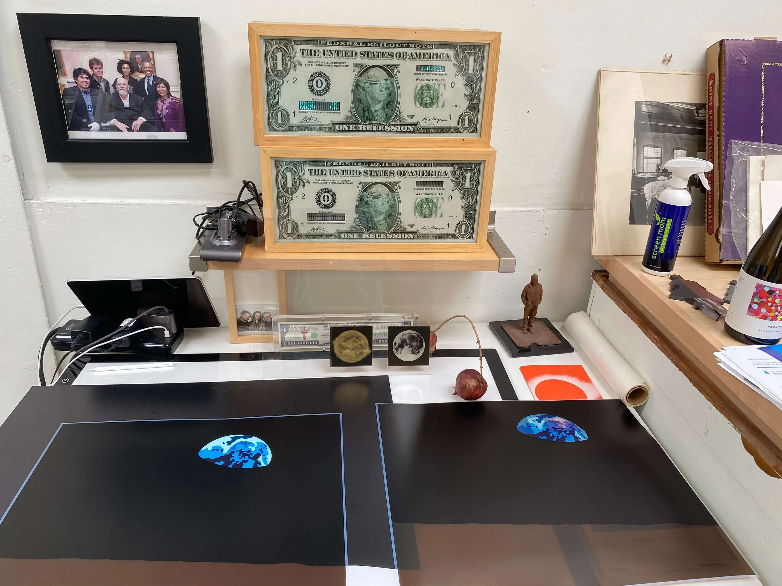
Don and Era Farnsworth, Frida, 2017, acrylic/aqueous paint, water-based and acrylic inkjet, hand applied gold leaf on engraved $1 U.S. bank note in plexiglass frame, 2.63" x 6.12"
HL: I want to come back to some of this in a little bit, but there's something interesting taking place here. So, your dedication, of course, to the paper for the Parma portraits is impressive, and the story is touching. But on another substrate, you've created this very unique series that carries so much cultural weight with it. You've experimented with printing and image making on US currency, and this has been a collaboration with your wife, Era, and a piece from this series, as you shared, will go to exhibit at the Tate in London. It's interesting that you're using a medium that carries so much weight with it. What inspired you to transform money into—
Photos with the Obamas, Enrique Chagoya money
DF: There's a long history of transforming, of making art based on currency and money. At Magnolia, we have madefabulous monetary works with Enrique Chagoya. We made a humorous and poignant billion-dollar note for billionaires only, a stretched dollar bill stretched out long.
US Greenbacks are one-third linen paper, I might add. It's a lovely paper to work on. And the challenge was to manipulate it in such a way as to make one-dollar bills into Art Notes communicating something other than US presidents. What's on our dollar bills are our presidents and other politicians, right? Jefferson, Washington, Franklin, Abraham Lincoln. So at first we wanted to substitute artists' portraits, and then we set out to also make commentary.
So we put many different artists on our first Art Notes, many of them were self-portraits, like Frida Kahlo. The project evolved, and we made imagery as if corporations sponsored the dollars; Dow Chemical, Roundup, Coca-Cola, to signal that we are living in a corpocracy. Moving on, we got a little conceptual and started putting gold leaf on the notes. So if you needed to spend the dollar, you'd have to scratch the gold off, losing more gold than the dollar was worth. We did so many of them. We did a melting dollar bill, and we did a fuzzy George Washington that is just a blur. We did one where George Washington's portrait is an eyeball, the inside of an eyeball, and it is just an educational note. And we did many of those educational notes, so that if you had this as actual currency and children looked at it, they could see the workings of the eyeballs and the name of the iris and the cornea—all these things right on the dollar bill as an educational note and an eye chart, as well, was in it. We also made geometry notes, mathematical notes. The idea evolved with the thought of making US currency more valuable in that it would be educational and informative, instead of what it is, a greenback with a president on it. On the back side, we change "In God We Trust" to "Trust No God."
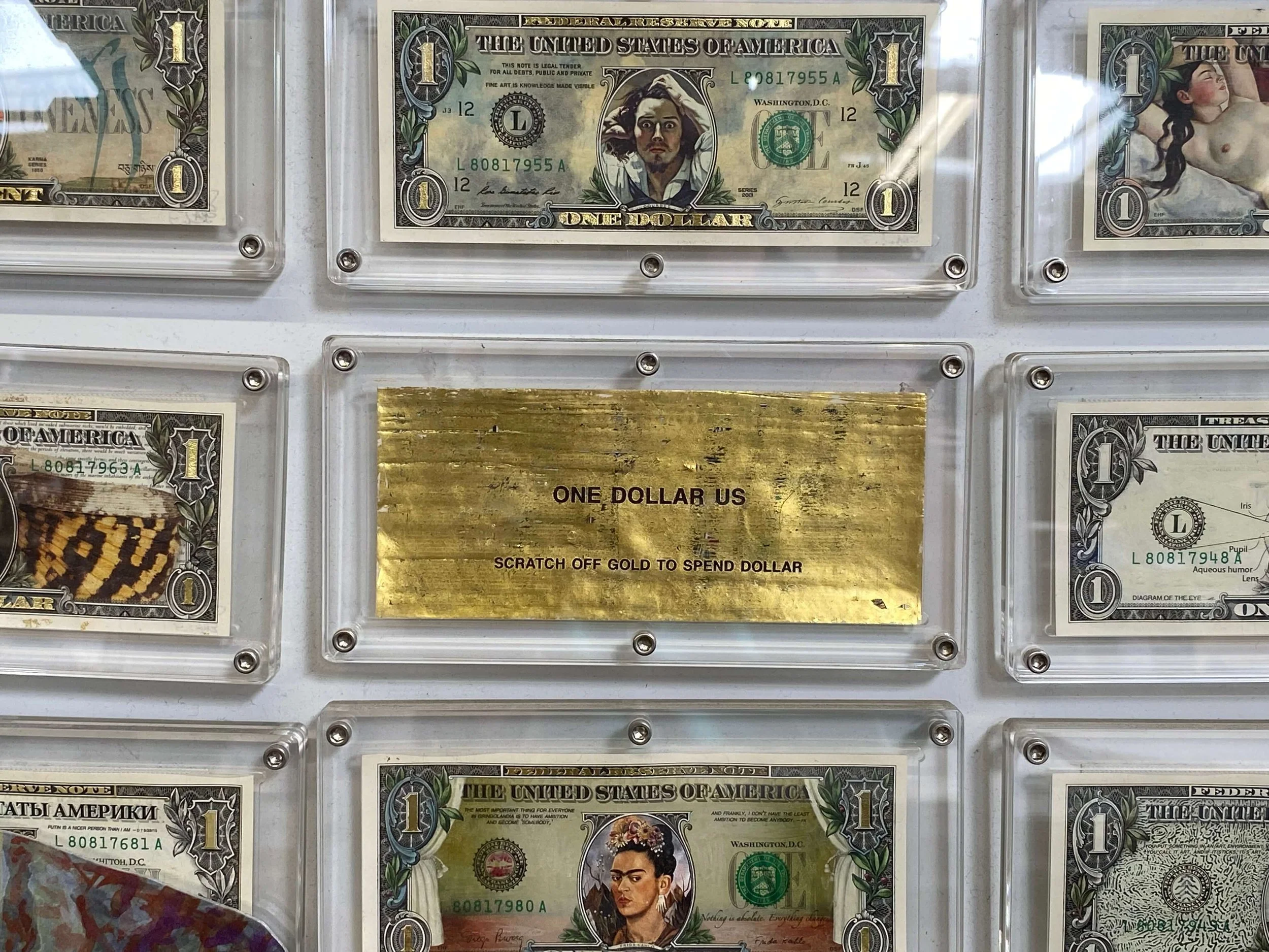
Altered Dollar Bills 2016-19
HL: There's something fascinating about it because, you know, money is such a cultural construct in the sense that it's just this artificial thing that people agree on to have value. And when you begin adding imagery to it and some of the things that you're describing here, what were some of the civic dialogue, civic discourse that you were hoping to spark through this and provoke?
DF: Well, actually, there are collectors that collect currency artworks, and the collections are fascinating. So many artists have done dialogue with currency. So we're one of many, and we approached it in a way to make it, I think, aesthetically pleasing and as perfect as we could. With the technology we have today, I think we were able to literally get the detail for the first time that hasn't been available to artists in decades past. We invented ways of painting out things. We matched the pigment of the paper color and painted out sections. Sometimes we shaved out the imagery with a razor blade so we could print on it; other times, we painted on the dollar bill in order to print. How do you print on a dollar bill? Say you paint out George, how do you register Frida in the same oval? These challenges had to be overcome; it took several months to get that right.
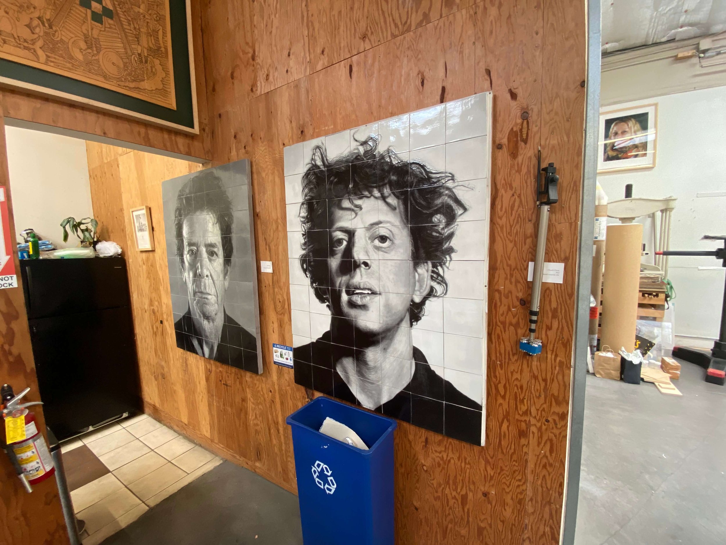
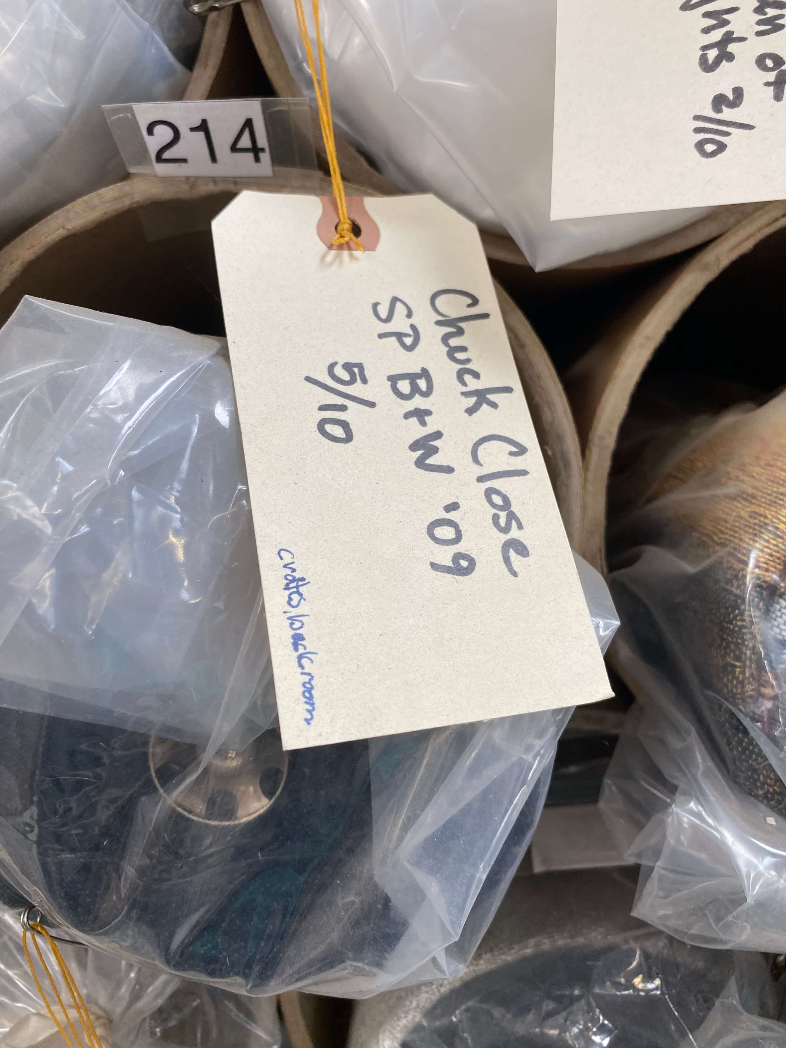
The Art Note project was simultaneous to all that's going on in the studio. We were working on a New York subway project with Chuck Close, weaving tapestries by Chuck, Kiki Smith, Hung Liu and Enrique Chagoya, and so many artists. And so the Art Notes project wasn't happening in a vacuum.
Chuck Close tapestry at Magnolia Editions
HL: Yeah. Let's talk about that. You mentioned Chuck Close. So he once described you as one of his most important collaborators. What was unique about your creative rapport with him, particularly as it relates to this digital and tactile process that began to emerge in his late work?
DF: That was flattering; I loved working with Chuck. We're both dyslexic and not afraid of making mistakes, so we had a solid connection. One day, he was in Germany, and I was in Oakland, California, and we were trying to edit a Kara Walker portrait over the phone and email. And he wanted to change the neckline, and he said, "On the left-hand side, I want the neck to swoop down towards the shoulder." He was trying to explain a major modification, essentially removing the far shoulder. I would make an edit and email what I thought he was asking.
He said, "No, the other left shoulder."
I would ask, "The sitter's left shoulder?"
We went on and on for quite some time —it was like 2:00 in the morning for me, in my defense. I was half asleep.
Finally, he said, "Are you fucking with your poor dyslexic, crippled friend?" And I said, "No, it's just that I'm dyslexic."
He laughed, saying, "So am I." We got it right after that. It was pretty funny.
Chuck was great to work with. Describing his work process with Joe Wilfer, his previous collaborator, who died in 1995, he described how Joe would come up with ideas, and "I shoot them down." So that was my collaboration with Chuck, 100s of ideas and techniques, some of which we could make work. Attempting to second-guess an artist is always a humbling thing; it's surprising how wrong you can be as to where they actually want to take the piece. Once in a while, we would get it right. We would sort of—it would come together, and we would understand each other. But it wasn't a matter of finding one spark and bringing that spark to life. It was more like a Roman candle where there were a million sparks, and one of those sparks was found to be worth exploring. Over our 20 years of collaboration, many pieces in numerous media were made. Sadly, Chuck died in 2021. I worked on the imagery for his tombstone, a self-portrait where Chuck was wearing a Yellow Raincoat made into a mosaic.

Atim, Physician, Infectious Disease Specialist, 2023, chalk and mixed media on handmade paper
HL: It's interesting the idea of bonding through the challenges of dyslexia. You know, something's occurring to me. There's something very interesting about the seemingly disparate series. So, you've got the money series, which is—there's something kind of tongue-in-cheek about it and very much so loaded with cultural symbolism. On the other, the Parma portraits, I mean, there's this labor of love in the creation of the paper and even going to Oxford to talk about this, something you're deeply passionate about. Then it becomes, like you said, a love letter to these people, to your wife, and so on, while you're on your deathbed. When you think about these two very different realms, the Parma portrait series clearly becomes something that has informed your life and not just your artwork, but just your outlook on life. Talk about that. How after your recovery and now that you're back, how has that affected the way you see the world, the way you see yourself, the way you see others in your art?
DF: Yeah, that's a deep question. When you get to the other side of death, but you find yourself still on the planet and still in a situation you were in months earlier, but you were knocking on death's door, rescued and saved by kind people on foreign shores. I was a supplicant and they, my kind and generous hosts. I don't speak the language, and they cared for me with love and grace, knowledge, science, and especially kindness. After that brush with death, one comes away thinking that every day is a gift from these individuals and my wife who brought me back from the brink. So I look at every day with the thought, I'd better get something done that is worthwhile. This is a gift. I drew their portraits on days that I wouldn't have naturally had. I surely would have died.

Self-Portrait, 2023
receiving blood (Parma)
2023, chalk and mixed media on handmade paper
My hemoglobin was going downhill. It was at seven. Males of the species usually have a hemoglobin of around 14, and mine was half of that. And every time they gave me two bags of blood, it would go up to eight. It went up to nine once, went to 9.1, but it would fall back in the following days. One dangerous day, it went down to a five, which can be an organ shutdown, stroke, or heart attack kind of area. It was the day after they gave me my first Rituximab infusion, which was the monoclonal antibody that saved my life and got me back to almost normal. But they expected that morning that my hemoglobin would have gone up. Instead, it plummeted. My caretakers had to scramble to warm the blood and prepare it. They couldn't just put a bag up there and connect it to the port in my arm. You have these processes, these stages you have to go through to get the blood ready for transfusion; it takes time, and time was precious. That blood elevated my numbers. After that, the Rituximab kicked in, and the monoclonal antibody that they gave me was killing the antibodies that were killing my red blood cells.
The diagnosis was Covid-induced Cold Agglutinin Disease, a very rare autoimmune condition. My own antibodies were destroying my red blood cells, especially when I was cold; I had to stay warm or my blood would agglutinate. My blood would get thick. If your blood is cold, if your body (and blood) is cold, just like a glass of water, the molecules are vibrating slowly. The warmer you are, the faster your blood molecules vibrate. With red blood cells vibrating quickly, the antibody can't place a marker that tells your body to "destroy this red blood cell." Anyway, that's what I understand is happening. That episode helps me to realize that life is not forever.

Eugino, 2024, Artists Portraits
chalk and mixed media on handmade paper
HL: The paper that came out of the Parma portraits project and that you had been working on for years now, there's something very analog about that. But at Magnolia Editions, you're using all kinds of new technology. I mean, just right off the bat is flatbed printers, and you're working with a number of different artists and different mediums. There's a fall 2023 newsletter where you note about the importance of ongoing commitment to mentorship and experimentation through new print and paper formulations as well as new technologies. How do you sustain your creative curiosity and openness to risk after decades of technical mastery?
DF: Technical mastery might just be the ability to adjust to a given situation. Every circumstance is different and requires creativity, experimentation, and determination. In the last couple weeks even—Max Thill and I have been experimenting with making a specific paper casting, a belly button and other body parts, and it's an entirely different paper than the Renaissance-style paper we made for Guy Diehl, Calida Rawles, Max, and the Parma Portraits. Paper is versatile and can be made to accommodate many varieties of media and purposes, but in every situation, we must employ thought, tests, and cunning. Tallulah currently has another project we're doing with Calida Rawles. The artist wants a solid block of gold leaf, on large sheets of Renaissance-style paper, on top of which is printed acrylic. We're combining 800 years of technology; Renaissance-style paper, gilding, in combination with the tools, techniques, and medium from the 20th and 21st century (UV-cured acrylic) to create a series of pieces that express the vision of artist Calida Rawles.
Just today, Max had substituted a thin coat of acrylic medium instead of traditional animal skin glue, which we typically use to size paper. So mastery may be an illusion, and at the very least must be combined with experimentation and hard work. It keeps us on our toes. I guess that was your question. What keeps you going? Simply put, adjusting to adversity. It's incredible how often we think we know what we're doing only to find out we don't, and that there's more to know. There's always more to know. Keeping going, staying excited can be summed up in the word: curiosity.
If there's one thing that I've learned in the process, it's that the paper that we're making is perfect for the sanguine chalk of the Renaissance. Most red chalk today is Conté. Conté was invented in 1795. It's compressed pigment, clay, gumarabic. You can draw with it, and you can smudge it. When the Renaissance artists drew on this paper, they were using quarried chalk, tubular hematite dug out of the earth. When you draw with quarried chalk, the lines don't smudge. You can rub your fingers on them, and the image stays. When you see a Michelangelo, you wonder how didthis Michelangelo survive 500 years without smudging? It's because quarried chalk doesn't smudge.
So when we say we're standing on the shoulders of giants and you say, "Oh, yes, yes, yes. I draw chalk on paper." Well, if you're drawing using Conté, it's from 1795.
If you say, "I'm a traditional painter." Well, are you?
"Yes, I paint oil on canvas."
What kind of oil do you use?" you might ask the artist.
"Oh, I use an alkyd."
"Do you know alkyd is 50% polyester, invented in the early 1900s?" Acrylic became available to artists in the 1950s. We're standing on the shoulders of giants because of content and because of aesthetics and looks, but you can't necessarily get to that look by using today's materials.

Inside Magnolia Editions
HL: I want to pull everything full circle here because this is interesting. The idea of using materials of the past, the misperceptions of the so-called shoulders of the giants that we stand on, and you take that into your passion for paper making, something that clearly dates back millennia to ancient China. What does the future of paper making look like as we accelerate faster and further into the digital age?
DF: We continue to make traditional handmade paper, however, the tools and equipment are modern. Hand paper studios today use bits and pieces of the technology that surrounds us. Our vats are polyethylene, our press is hydraulic, we often use polyester and nylon interfacing. We employ plexiglass, nylon breather mesh, electric fans, and the list goes on and on. Brian Queen and Nicholas Price make beautiful and usable 3D printed paper moulds. Max Thill and other people I've worked with, Tim Barrett, Amanda Degener, Nick Pearson, Michelle Willson, and so many around the world bring creativity and innovation to the humble world of hand papermaking. There's still a company that weaves laid brass screening. But one thing I like to say, sort of tongue in cheek, we're documenting all this and putting it online at magnoliapaper.com so that when I die, if reincarnation is real and I reincarnate, I won't have to start all over again.
I think things skip generations.
In this Zoom interview, I can see you're wearing a white T-shirt. If I was there with my UV flashlight, we would see that the shirt you're wearing is most likely chemically optical brightened. If that T-shirt was washed in a Procter and Gambleproduct, there is a chemical included in their laundry detergent that binds with the cellulose. It's a nasty chemical that slows down the UV-wavelength of light hitting that shirt so that more visible light bounces off your shirt than would normally. Therefore, your shirt is whiter than white." Why? We must source rags that have not been treated with optical brighteners. That and so many chemical pollutants must be dealt with and addressed in our modern world.
Hugh Leeman: Don Farnsworth, a man who is very well prepared in case reincarnation is reality. Thank you very much for your stories.
Don Farnsworth: [Laughs] Very good! Thank you.